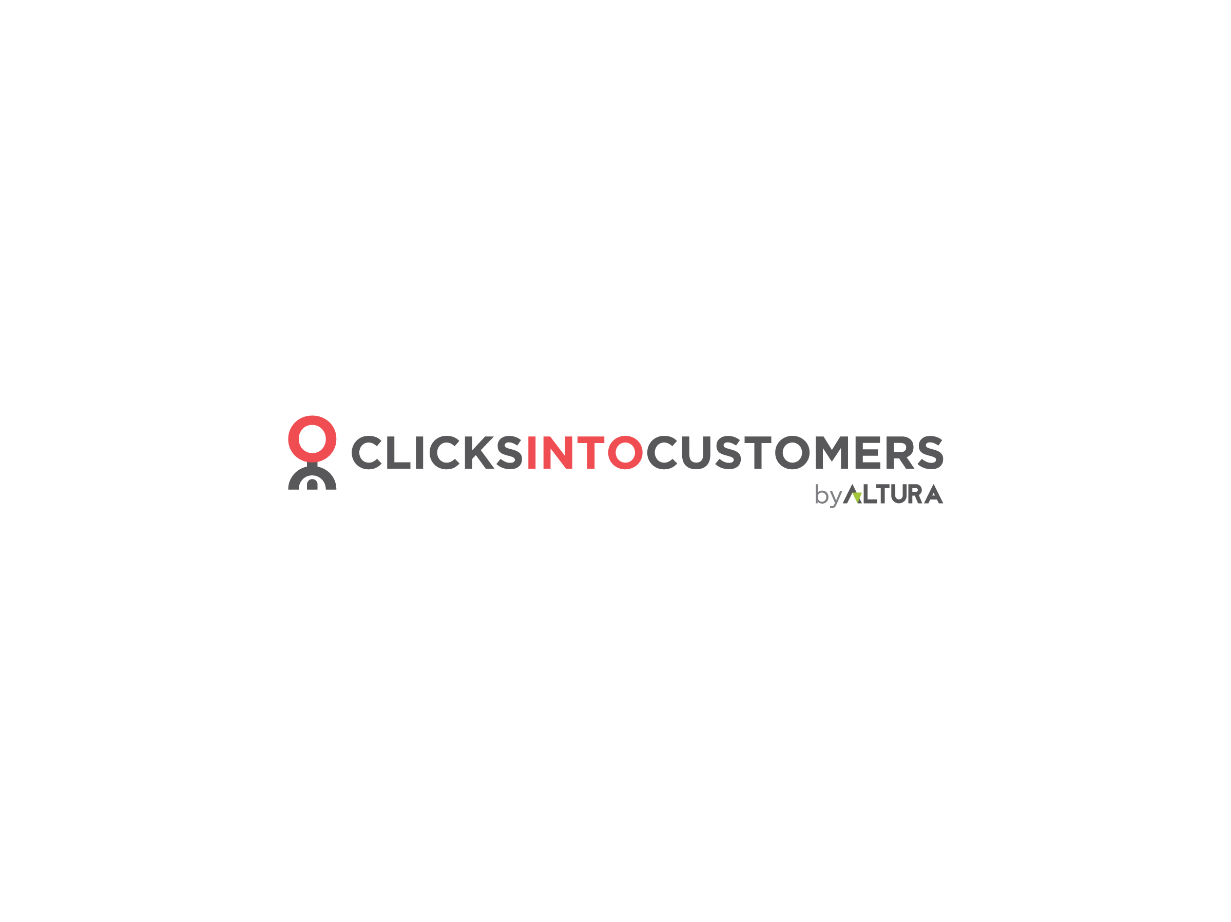
Client
EQ Rekruttering | Oslo, Norway
Info
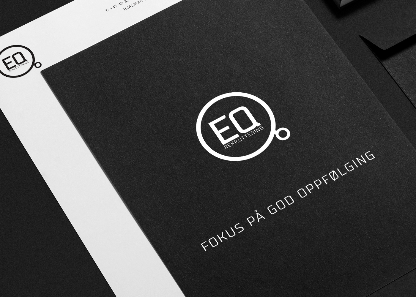
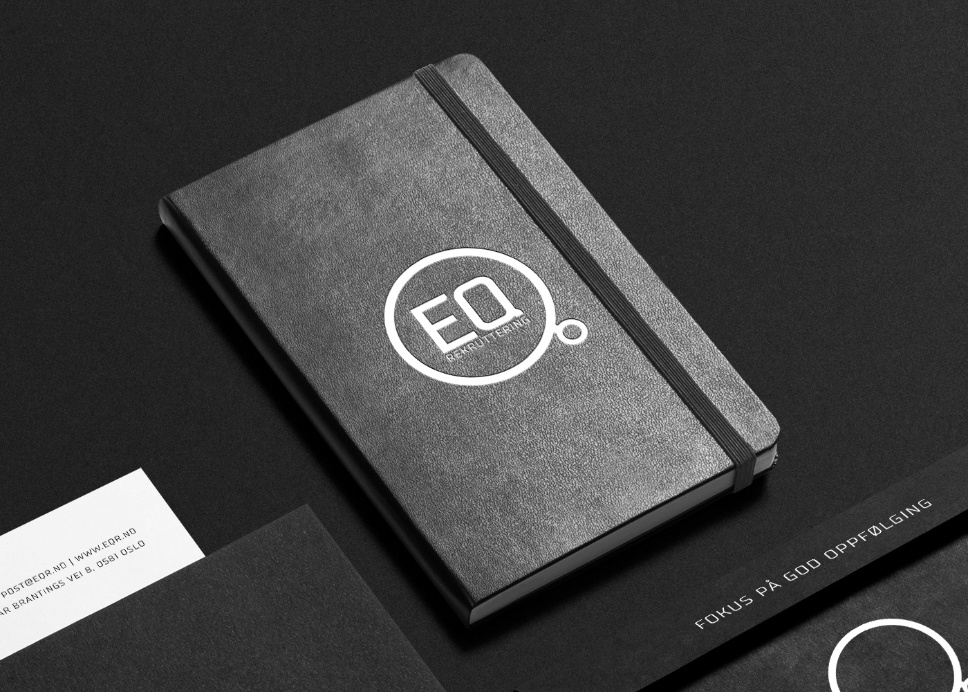
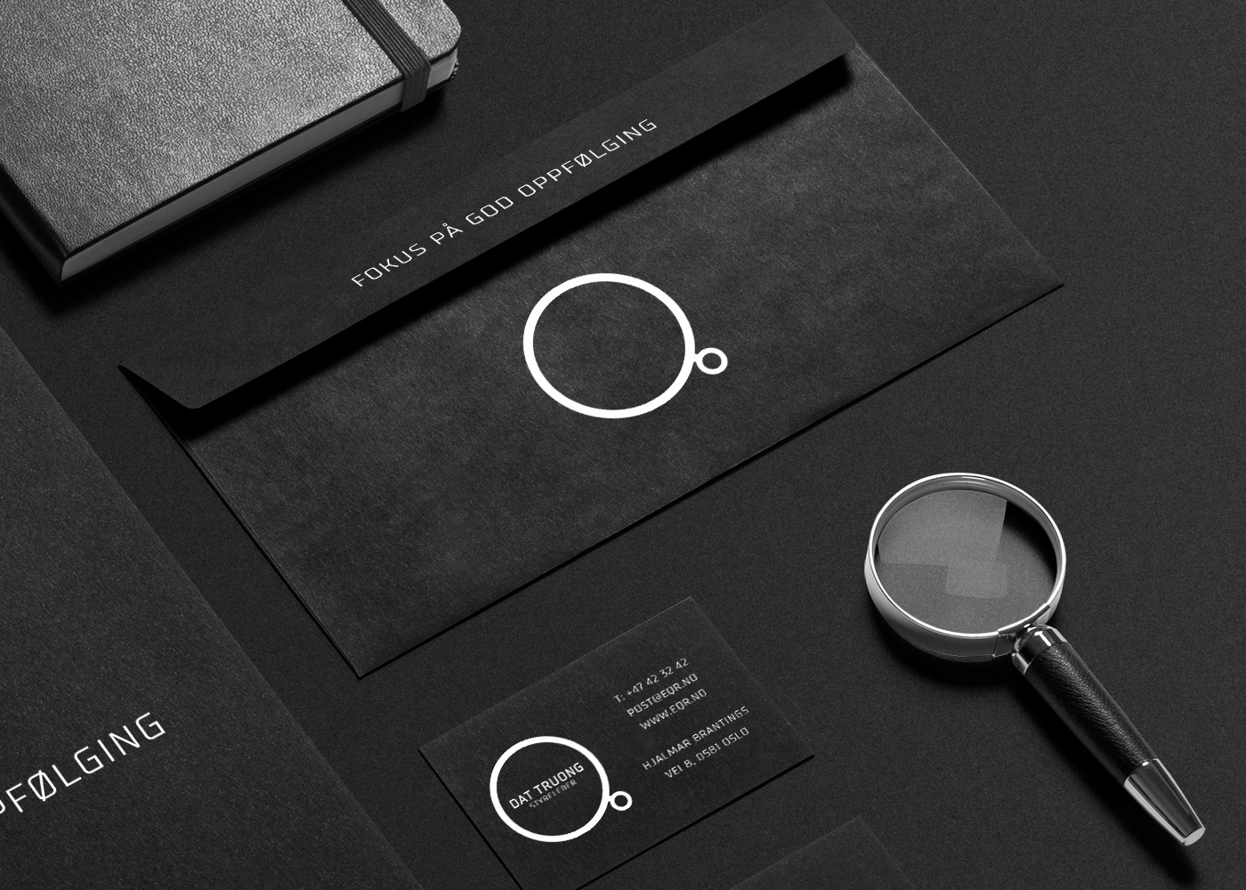
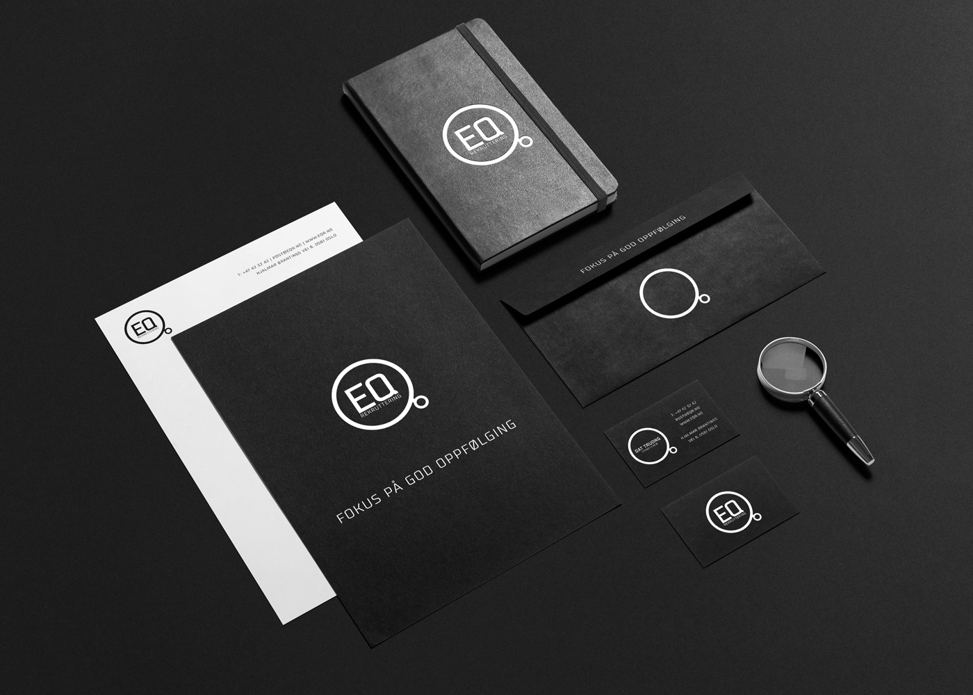
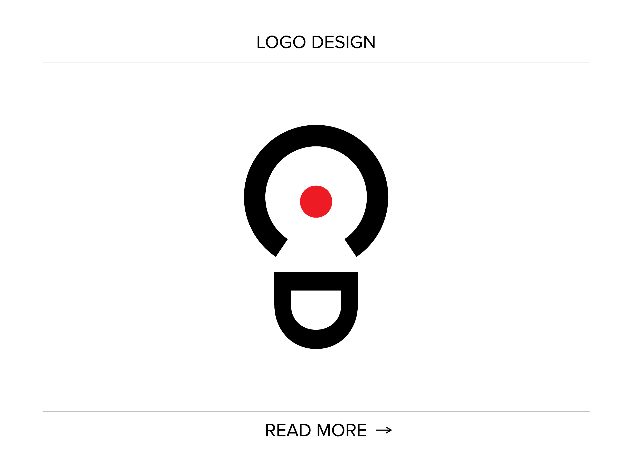
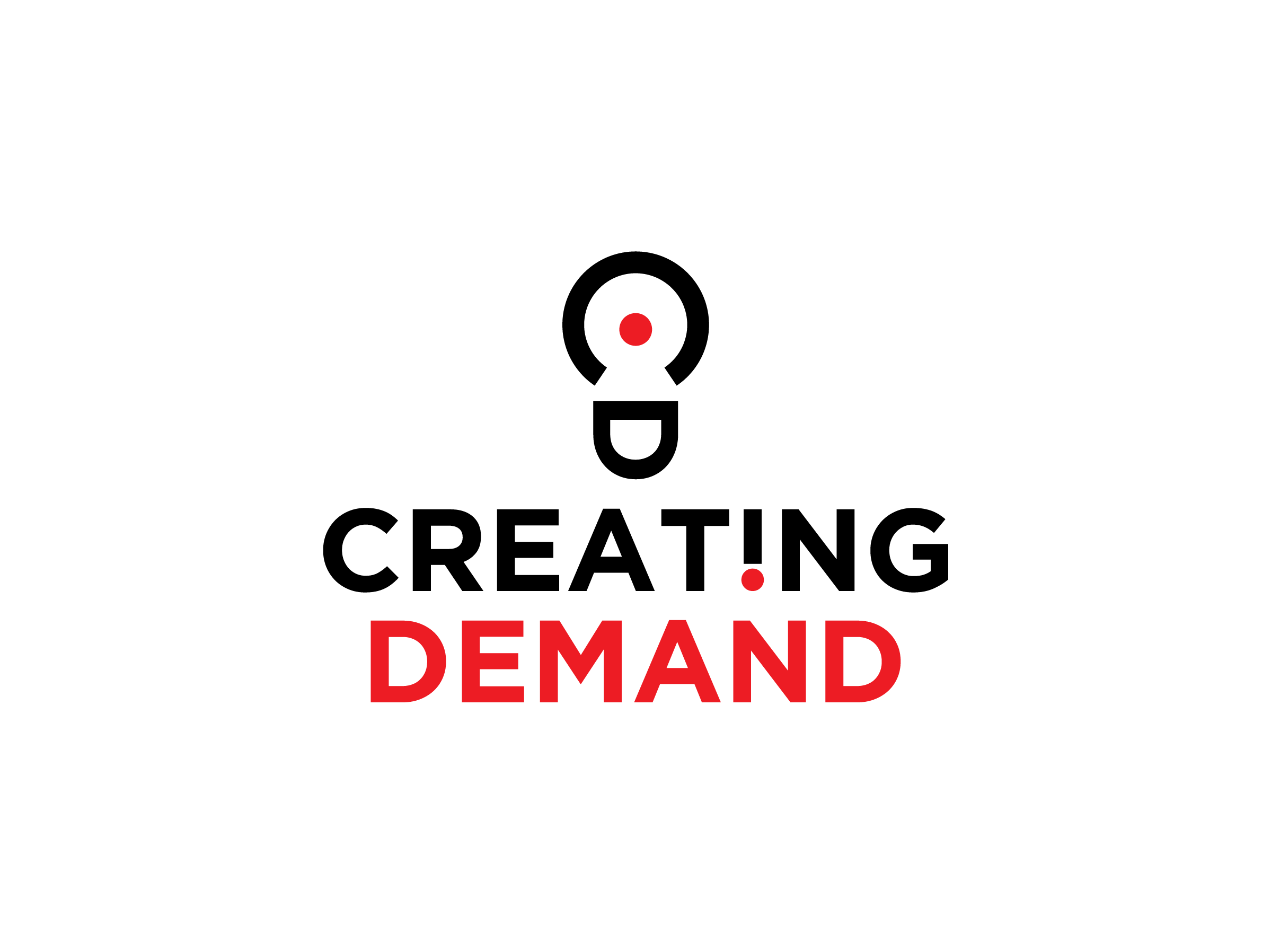
I was asked to create a simple, yet stylish and bold logo for a recruitment company that would visually distinguish it from competitors. The solution represents a stylised monocle that reflects searching, analysing, wise selection and as such depicts the company´s main objectives. Also, it can be read as an act of entering a person/candidate (small circle) into a big(ger) collective. Finally, the sign encircles the logotype, making it a focal point.