Client
Novacore Solutions | London, UK
Info
Novacore is a newly-founded consulting company that focuses on helping startups and young companies as they try to innovate in their marketplace. Novacore has requested a solution that avoids complexity, that is modern and subtle, yet evocative. Also, the company wanted to be perceived as innovative, fresh, flexible and with strong business acumen.
Creative Process
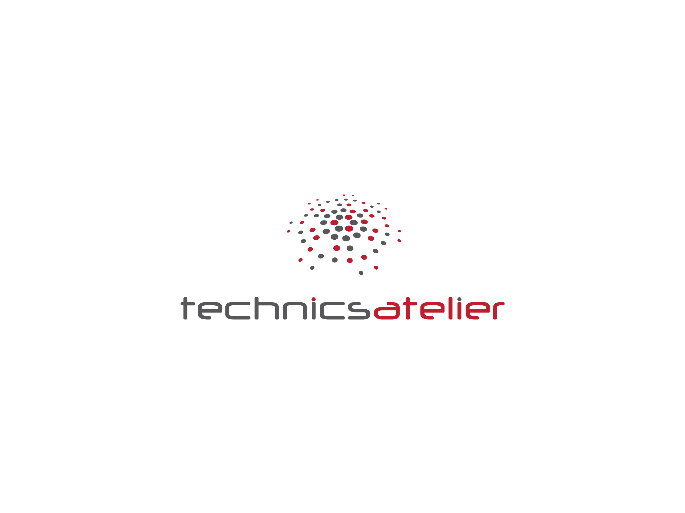
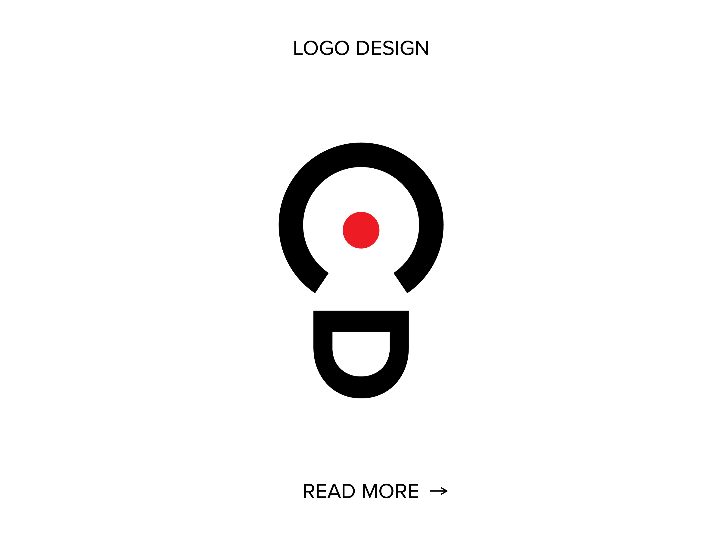
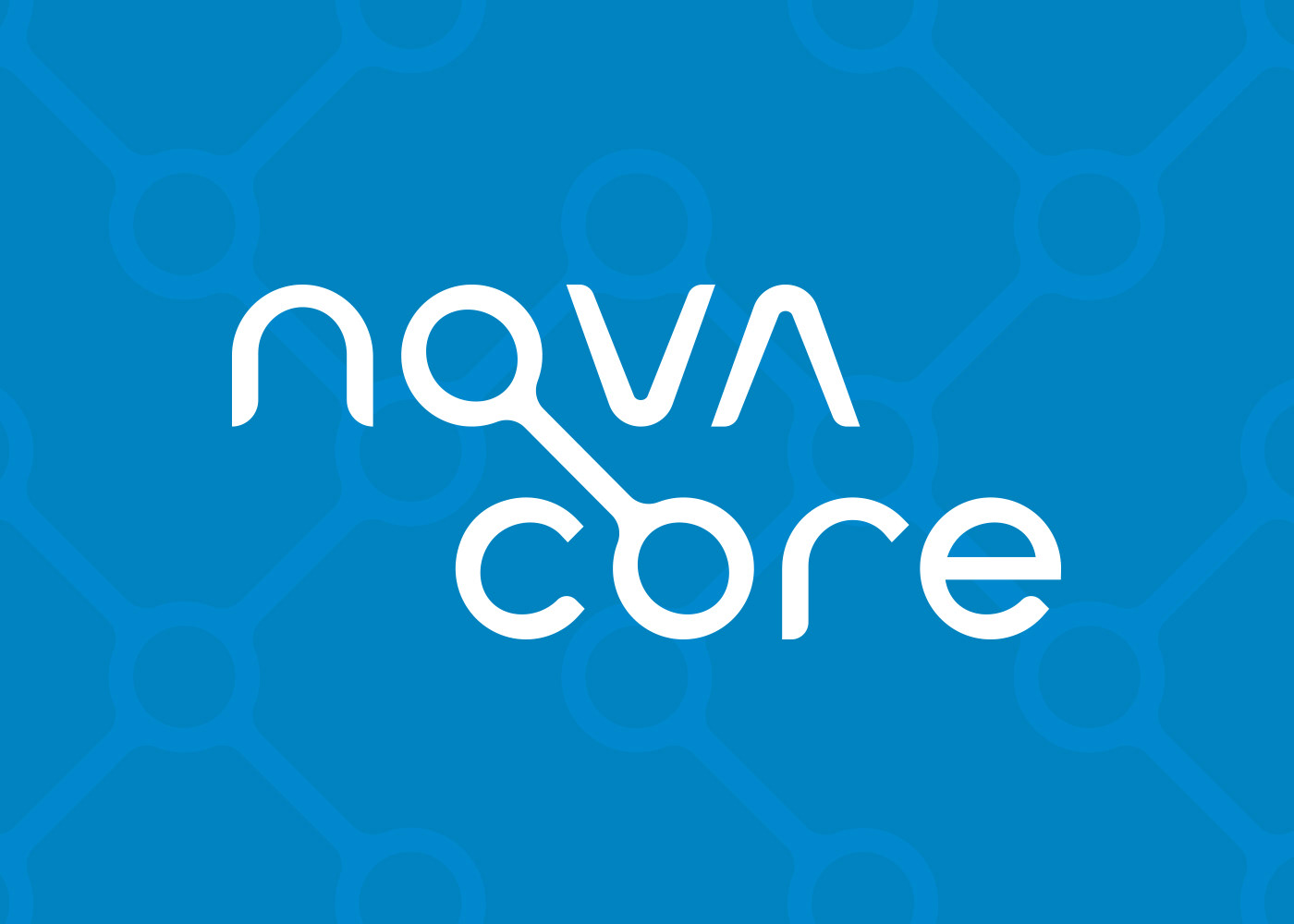
The creative process has started by “mind-mapping” and brainstorming the ideas. A circle and character “O” served as a natural starting point since they are an adequate visual representation of a core, a nucleus, and a completion.
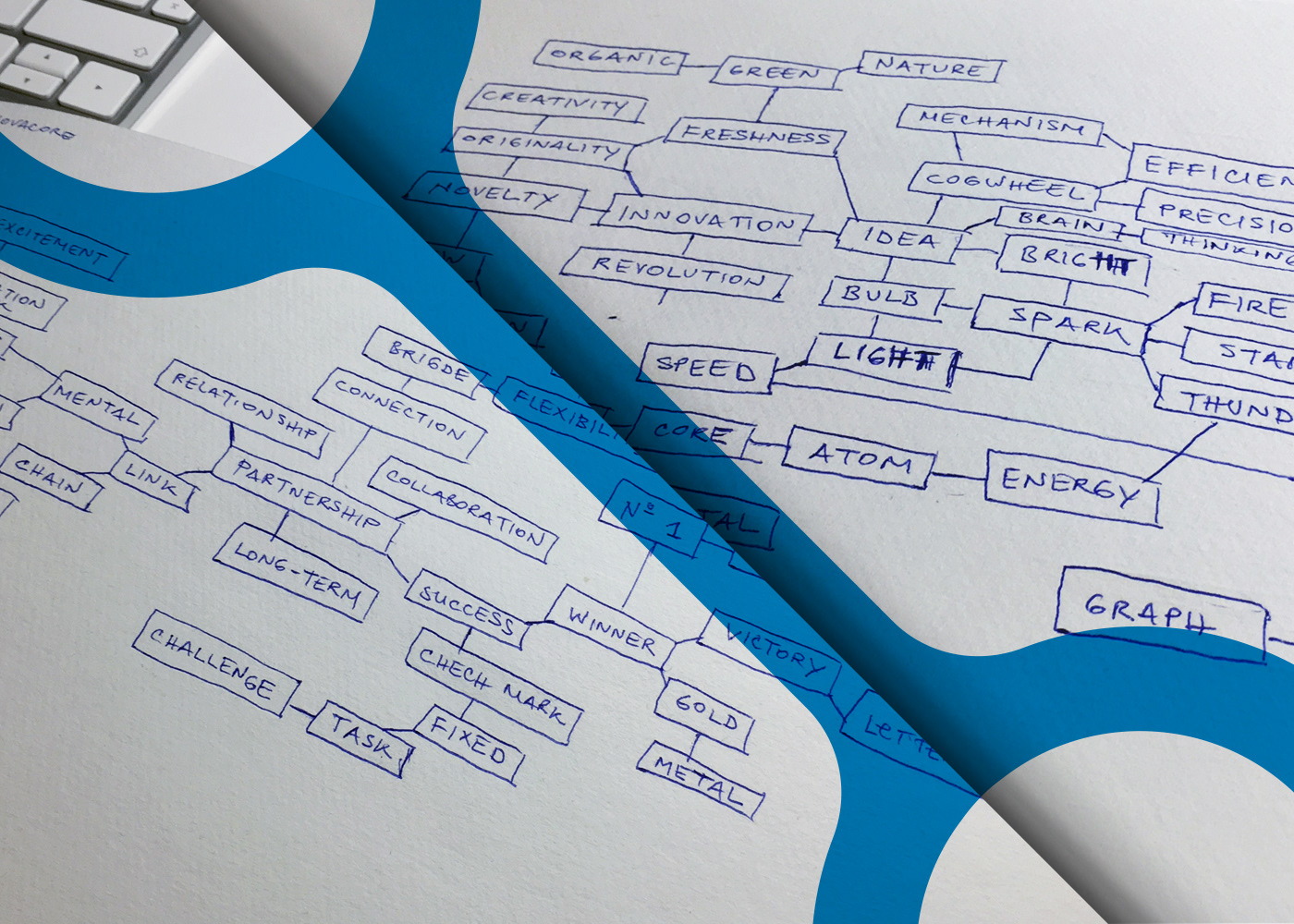
The next step has considered sketching the ideas that have emerged from the mind-mapping clouds.

Novacore has chosen several ideas from the sketches that have been further developed.

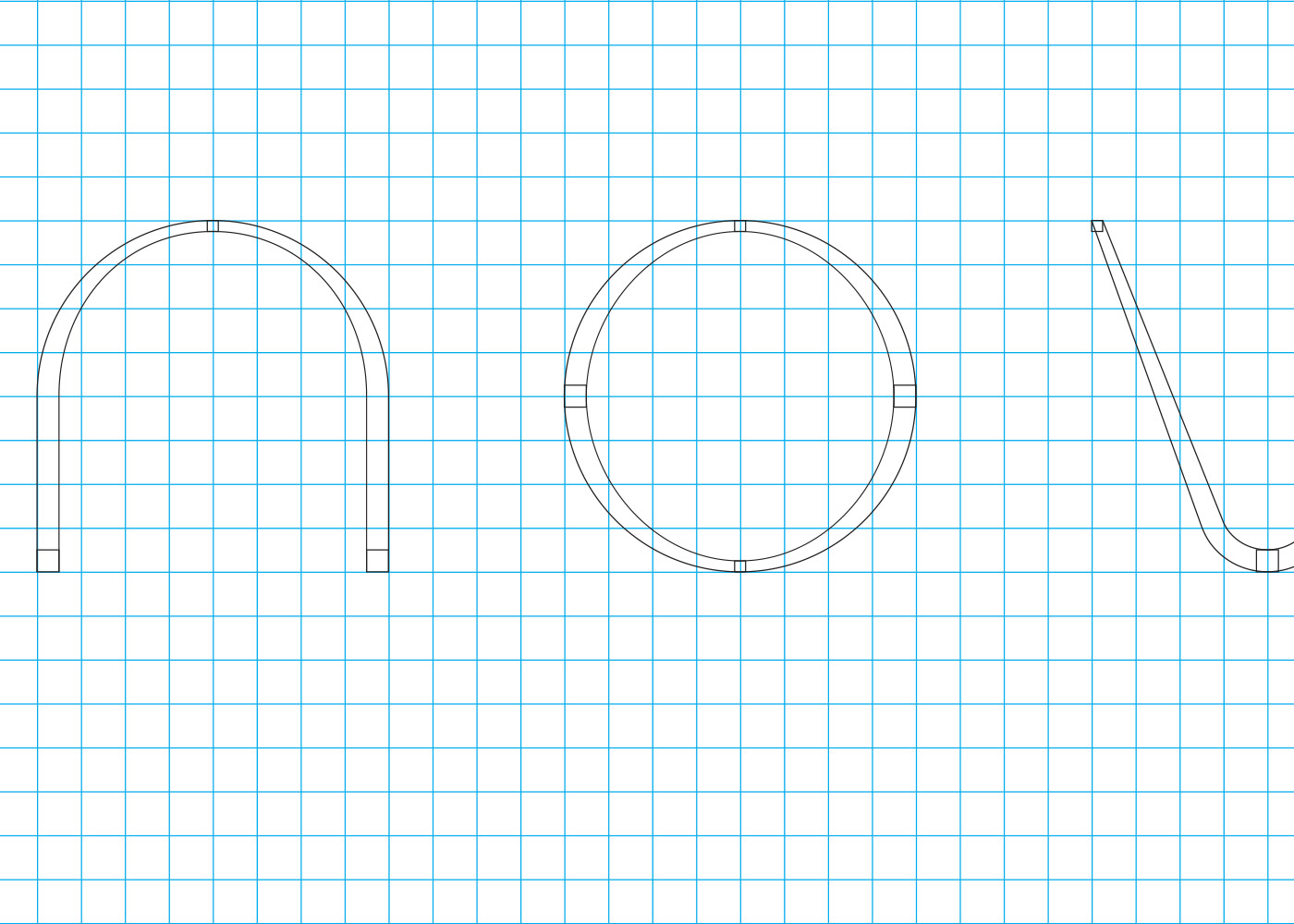
For the chosen solution the custom characters have been created:
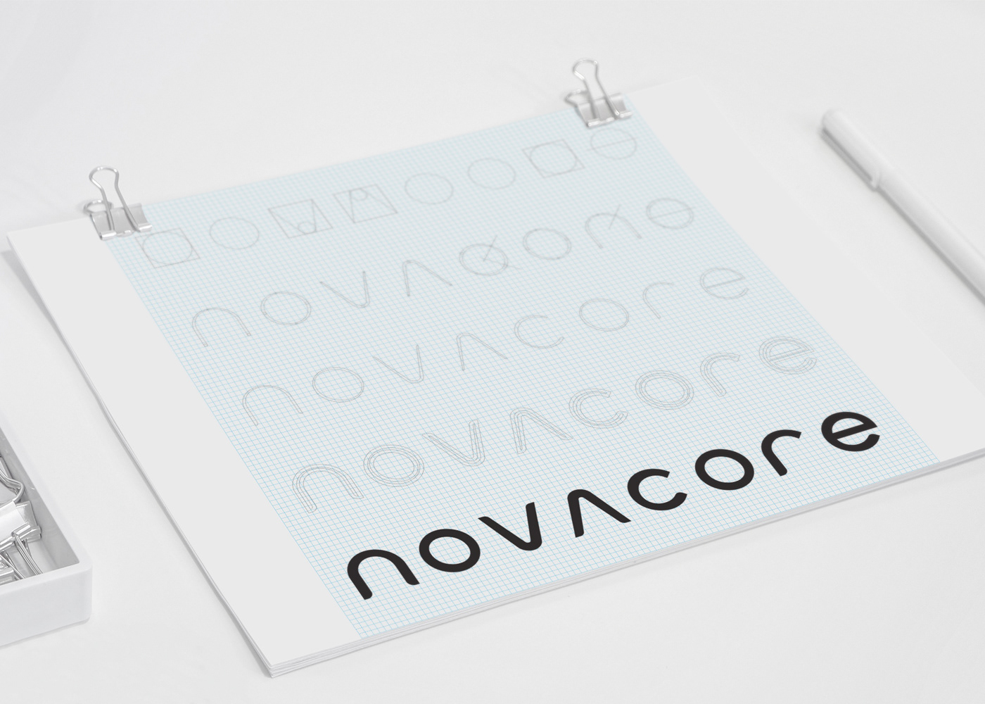
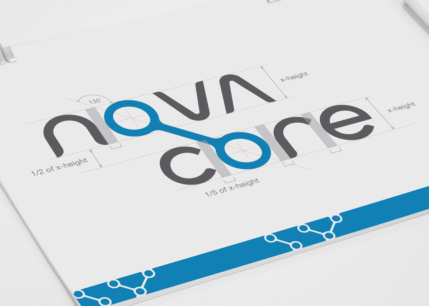
Delicate variations is strokes’ widths hint at flexibility, one of Novacore’s keywords, given in the brief.
In order to achieve better visual distinction between the words “nova” and “core”, the latter word have been put below. The axis that passes through the centres of the two “O” characters actually dictates the position of the word “core”:
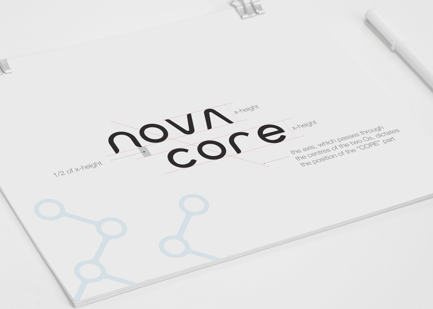
The axis served as a foundation for building a link or a bridge between the two “O” characters, and consequently the two words, echoing a connection and partnership. The logotype architecture is shown below:
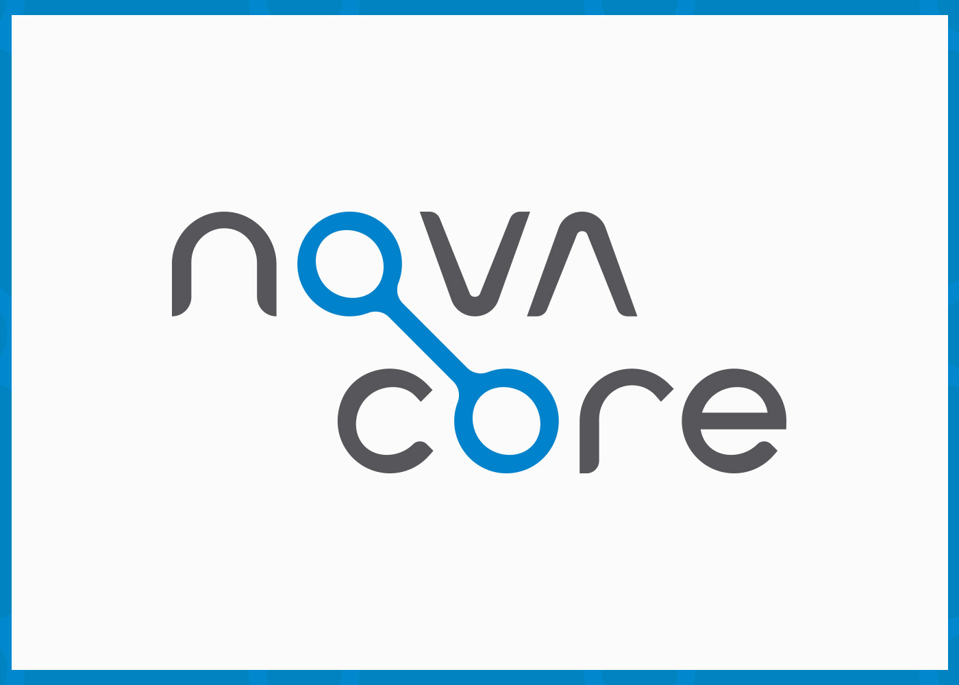
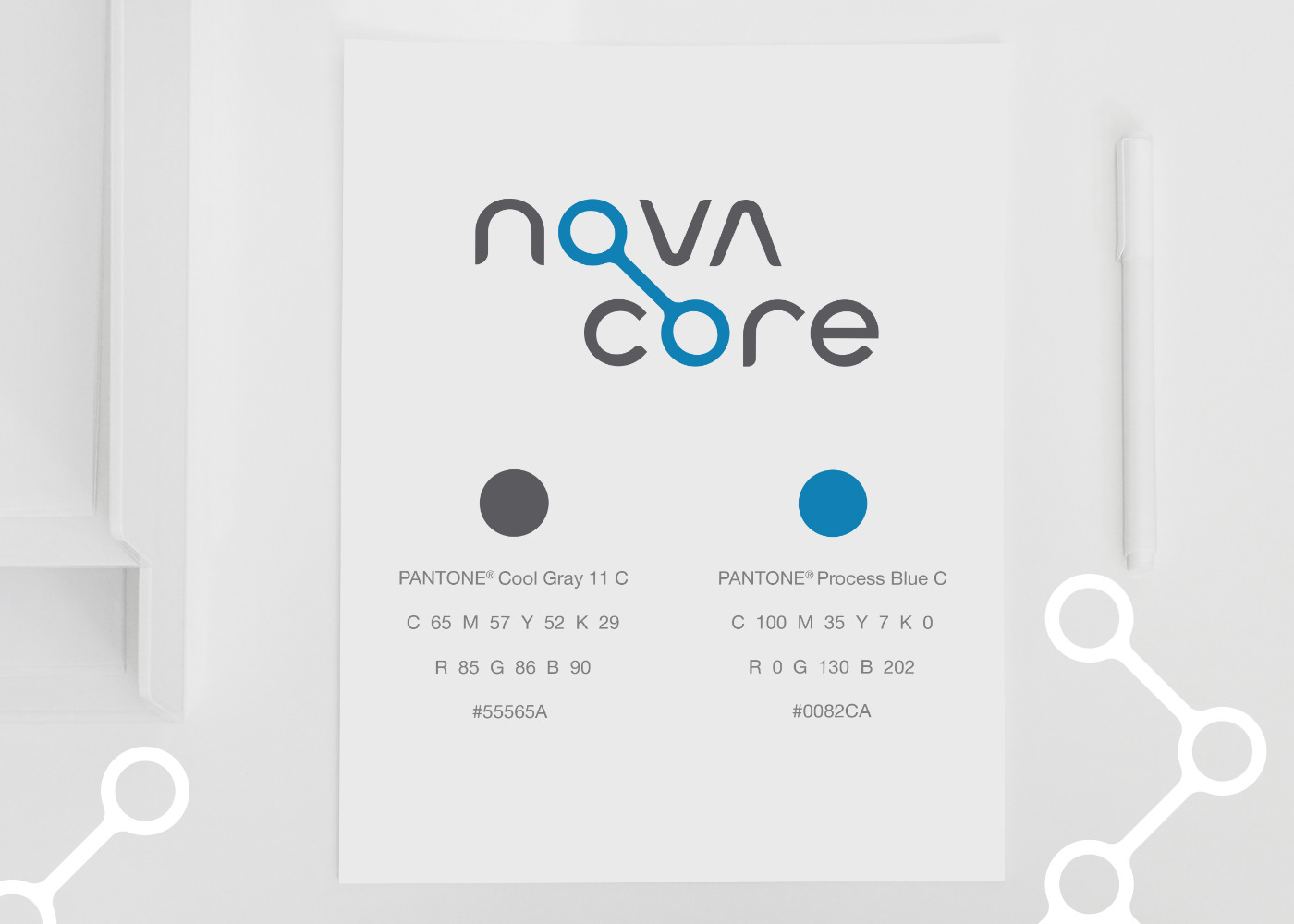
Novacore primary colours are defined below. They should act as the corporate colours and should be used throughout media in order to secure the visual uniformity and recognition.
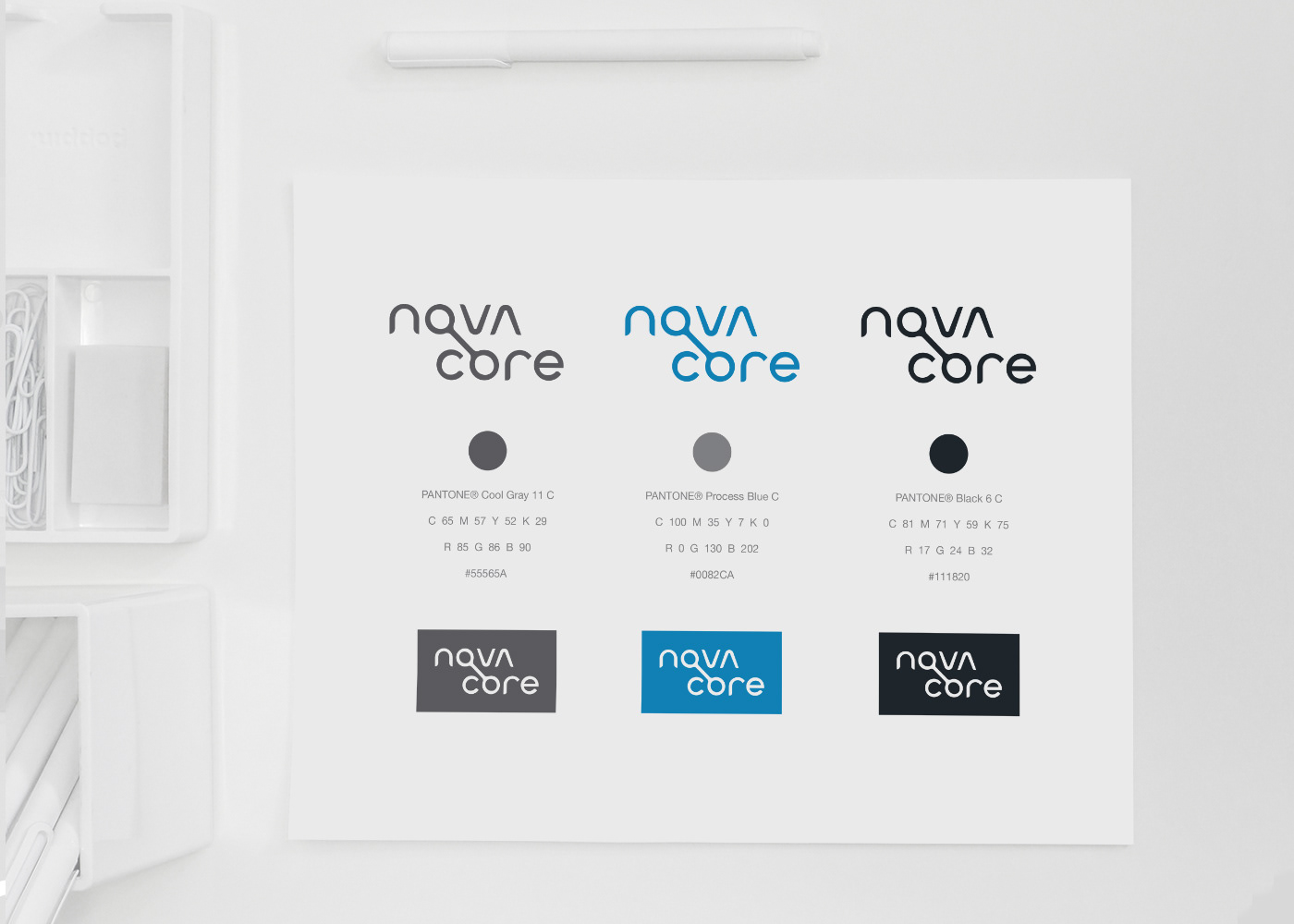
Secondary colours are shown below:


Clear Space
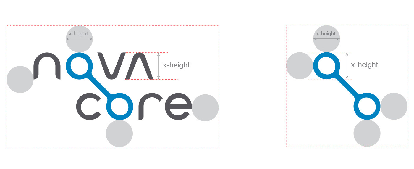
The clear space is defined by four circles which diameters are equal to x-height.
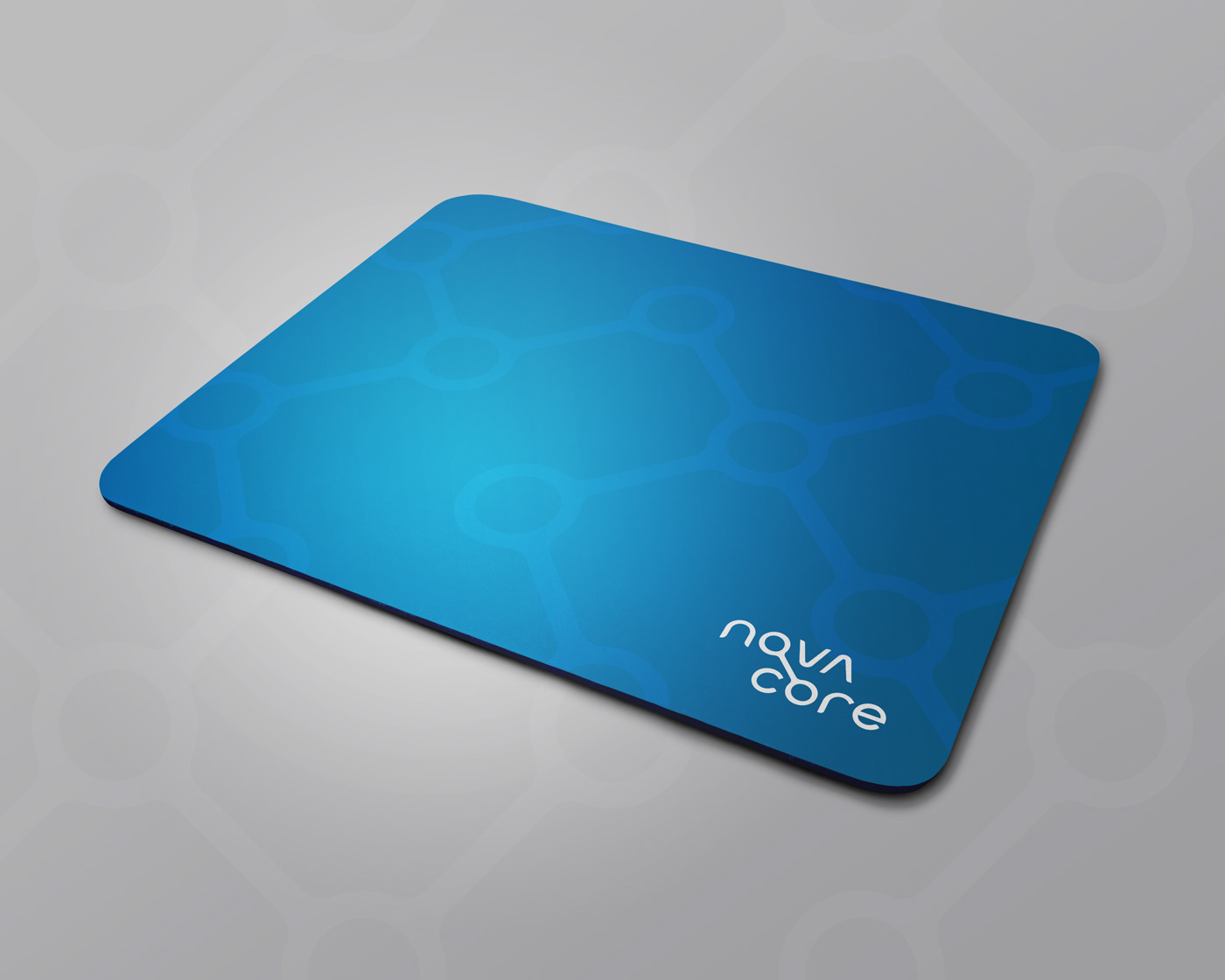
App Icon
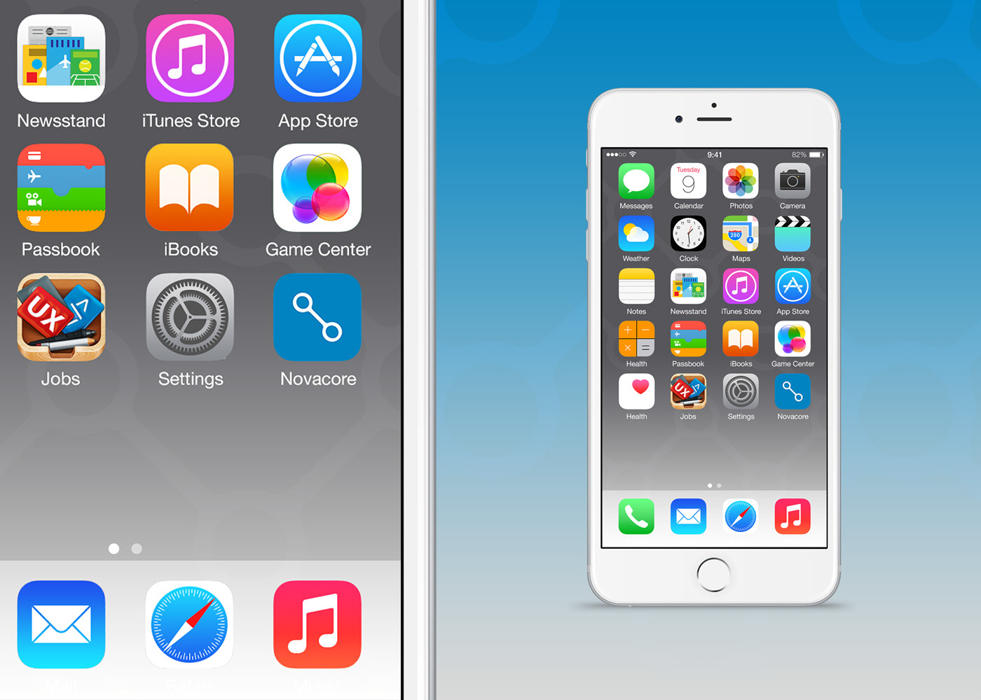
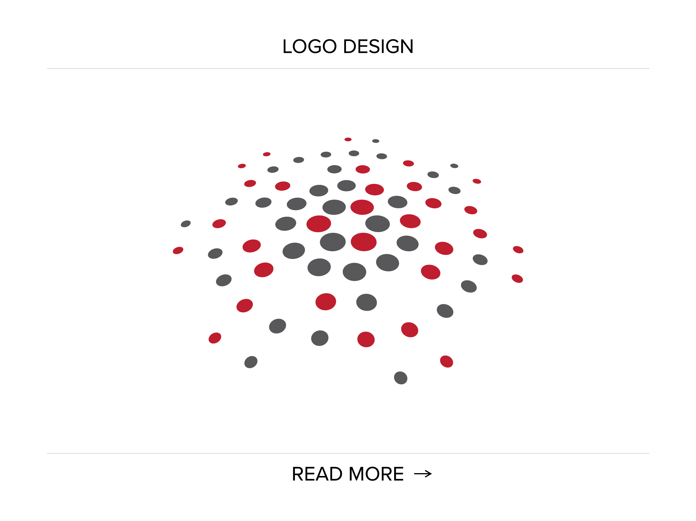
Novacore pattern has derived from the mark and as such makes a tight connection to the wordmark. Also, it secures visual consistency and relevantly depicts company’s values: long-term partnership, flexibility, a growth from a core.

Business Card Design – “Behind-the-scenes” Overview
The overall design of Novacore business card is the result of a balanced and economical utilization of the content. The 3x3 modular grid system has been developed, dictated primarily by the width of the logotype:

Please notice below how the title “the Consultant” (the client’s wish for the name) corresponds with the phone number and the e-mail address, and how the mark literally serves as a link between the upper and the lower textual segments. The mark is positioned in the center of the business card layout and as such it visually conveys the core.
As for the textual content, Helvetica typeface has been used.
The info has been distributed is such a manner to give the layout dynamic, yet balanced, simple and elegant look and feel. Please notice how the flow of the content corresponds to the mark.