Client
Seamless Solutions | Auckland, New Zealand
Info
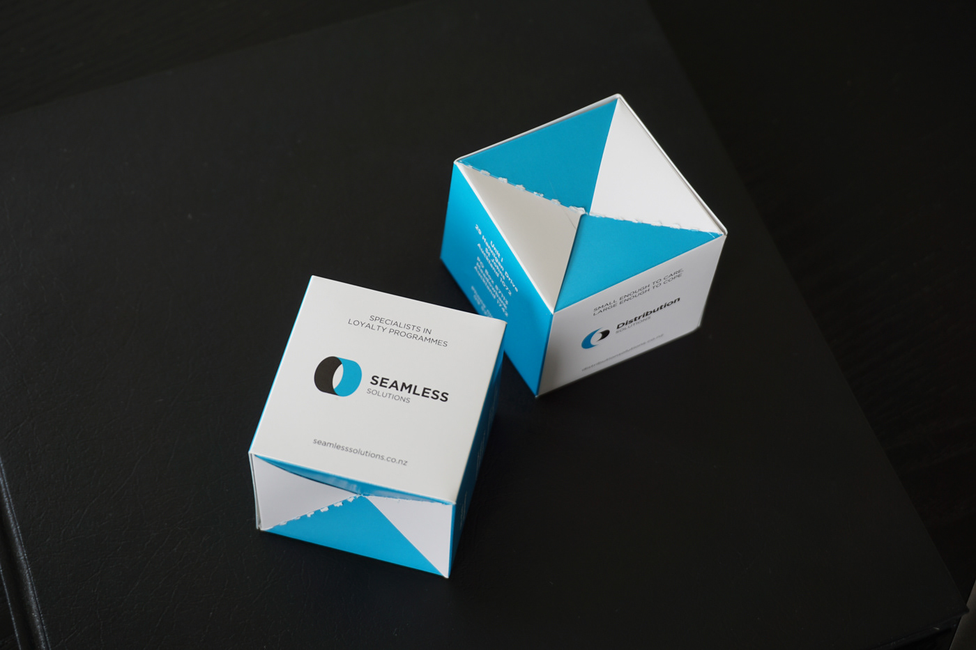
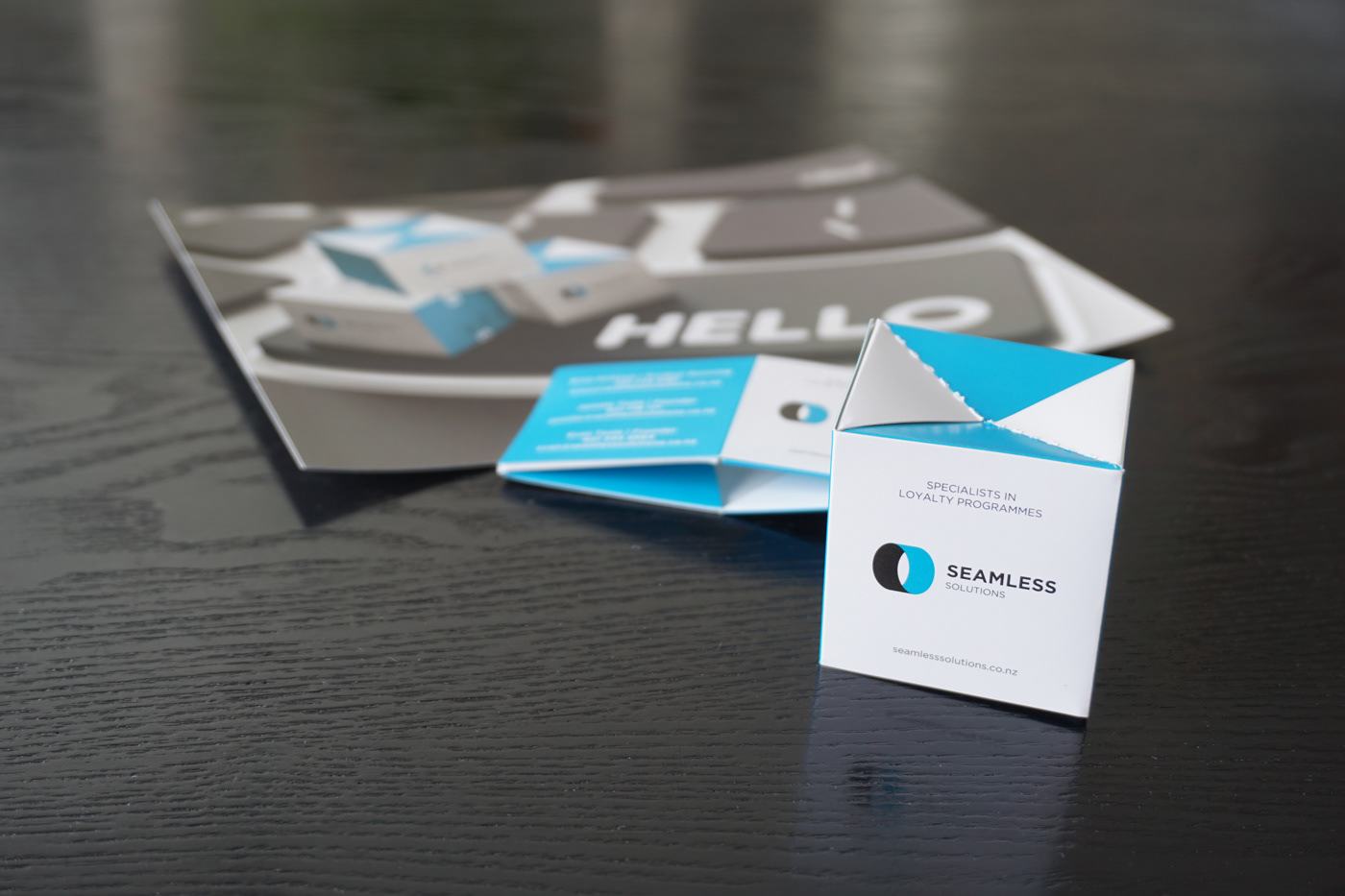
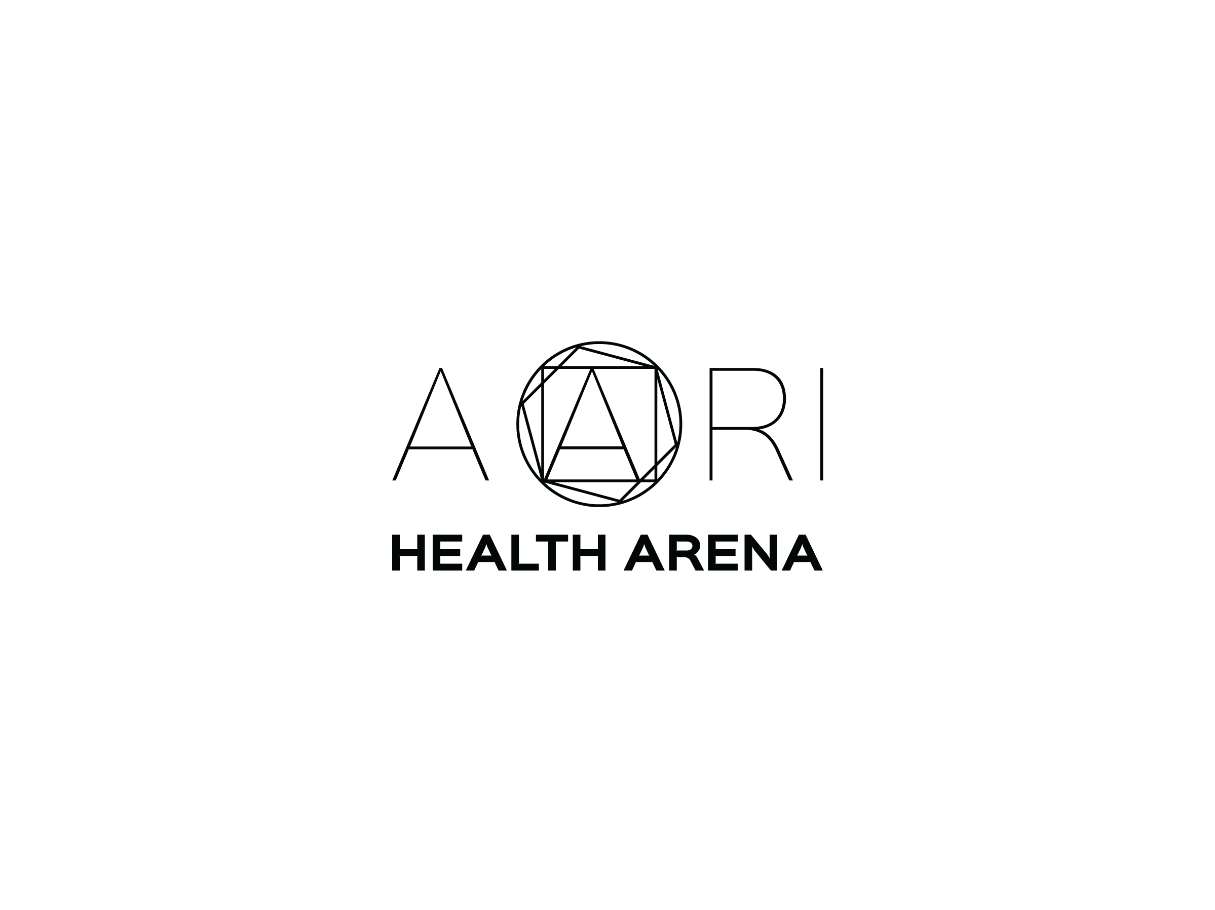
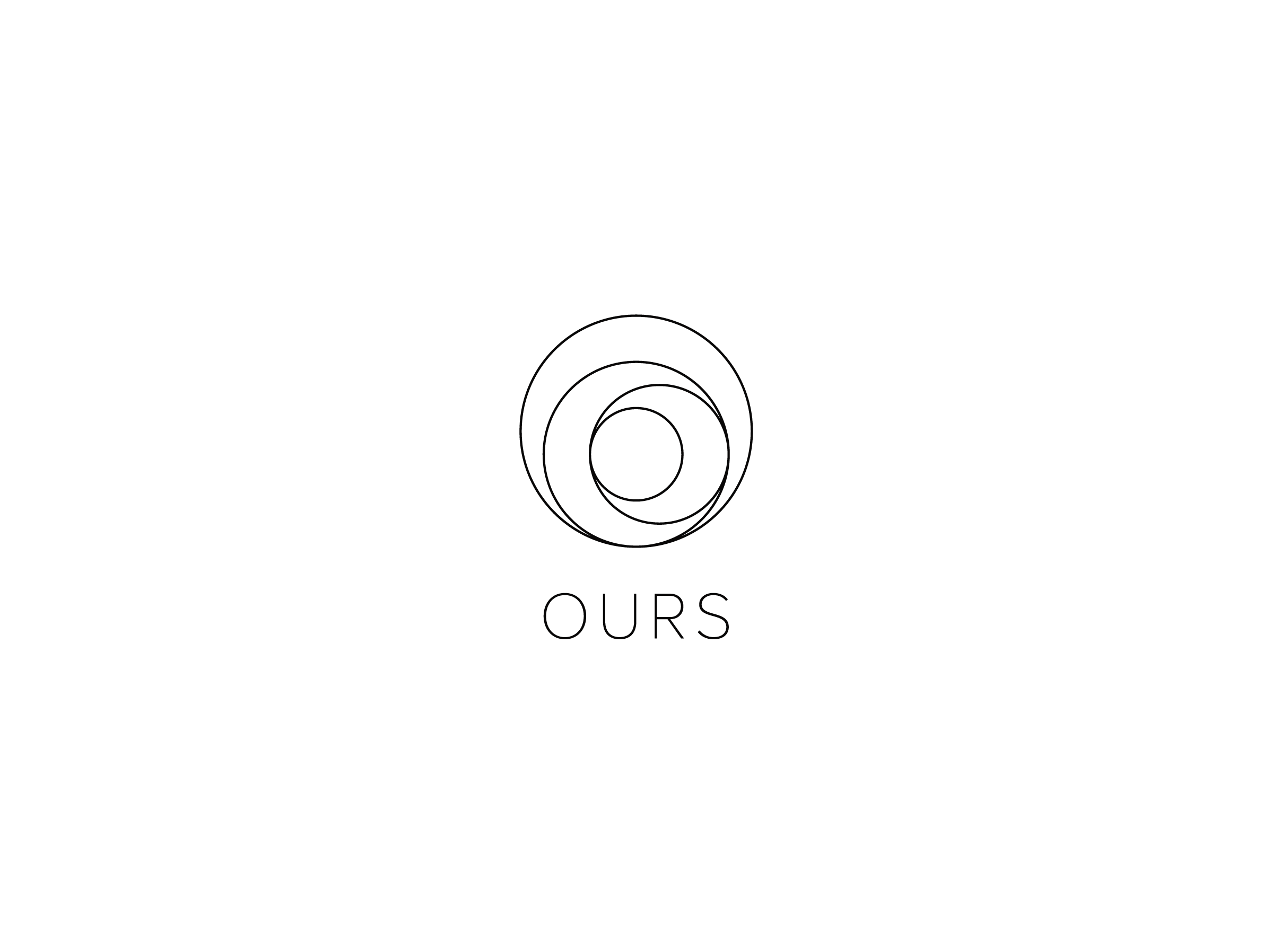
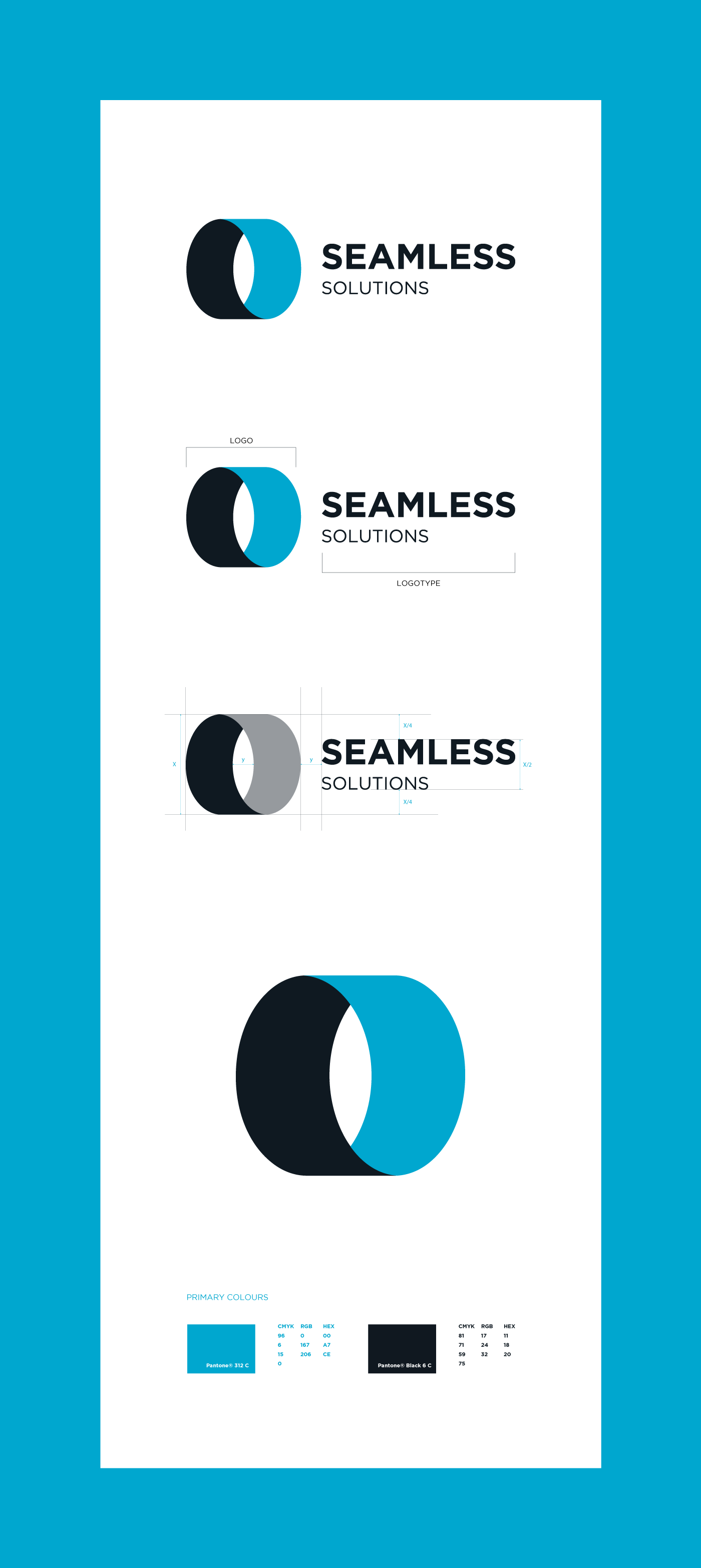
Seamless Solutions is a New Zealand based company which is specialised in sourcing and distributing an extensive range of products for Loyalty Programs within New Zealand. The company requested the redesign of its old logo. The new logo has a circular shape as a circle symbolises completion, seamlessness and protection. Another inspiration is a wheel, suggesting movement and distribution. Also, the symbol could be seen as a wrapping paper since the company takes pride in hand packaging each order.
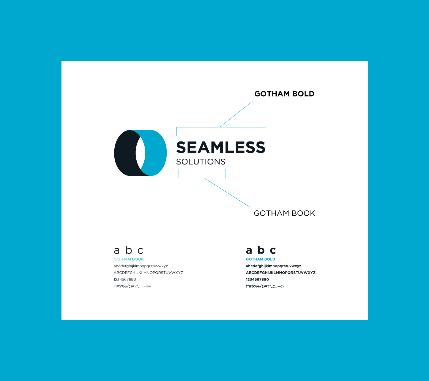
The primary corporate typeface for Seamless Solutions is Gotham. The Gotham type family was chosen for its clean, strong appearance and for its availability.
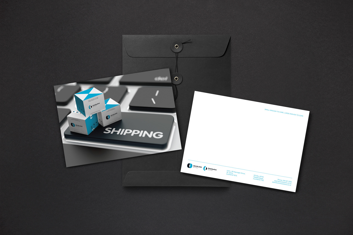
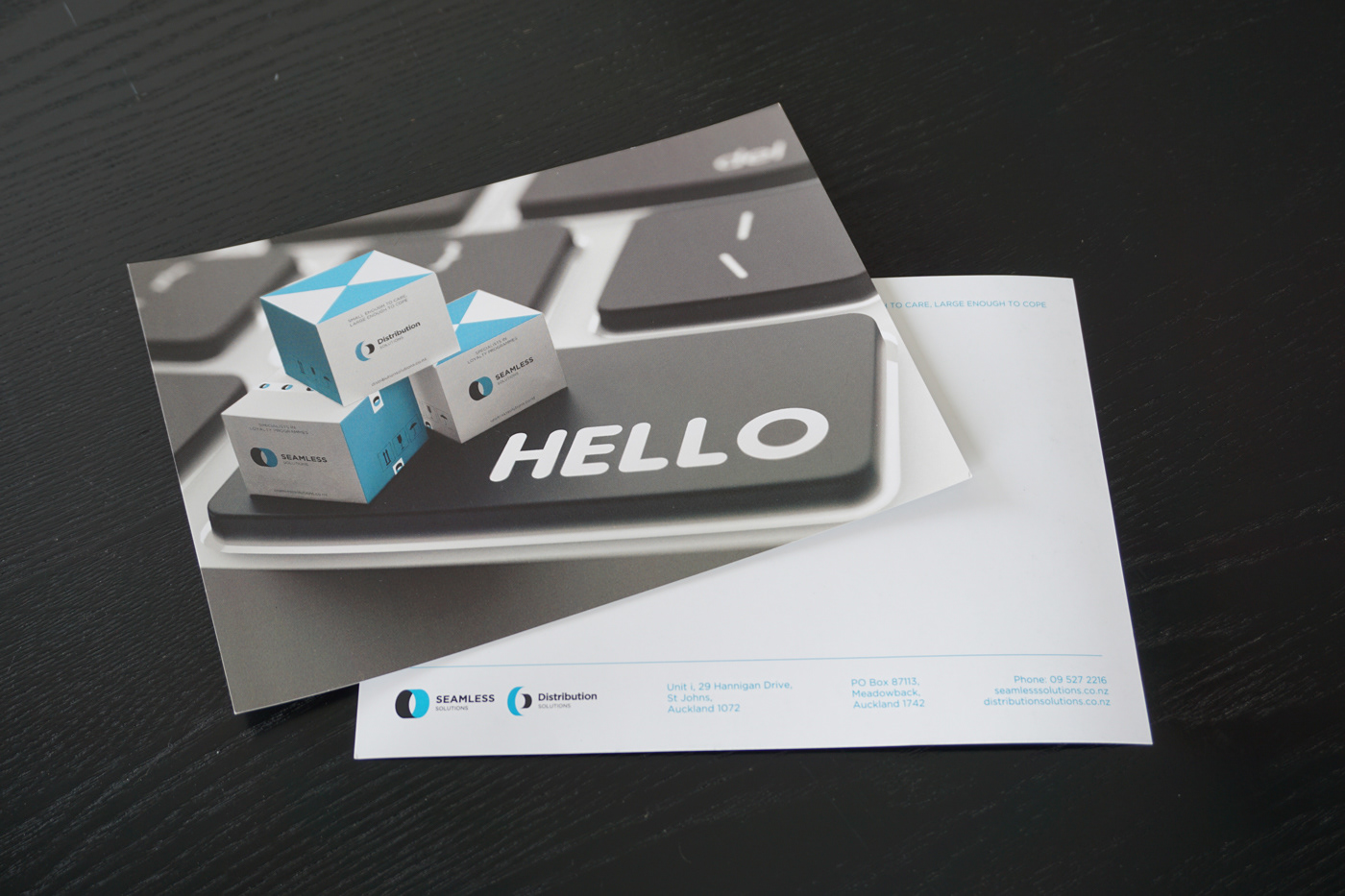
In addition to the logo redesign, the company wanted to refresh its stationary.
The company letterhead design is based on 3x12 grid system which secures that all the elements are well-positioned and balanced.
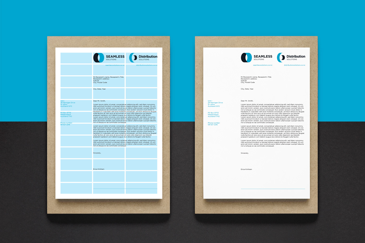
The compliment slip design is shown below.