Client
Creating Demand | California, USA
Info
The client wanted a logo that shows a modern, forward thinking company. They needed the company’s mark to look fresh, bold, and exciting.
Simple in approach, both the mark and the logotype respond to the client’s requirements. The modern, fresh and strong impression was achieved by the usage of bold sans serif capitals in the logotype. Furthermore, the character I is replaced with a ! to bring a feeling of excitement and determination.
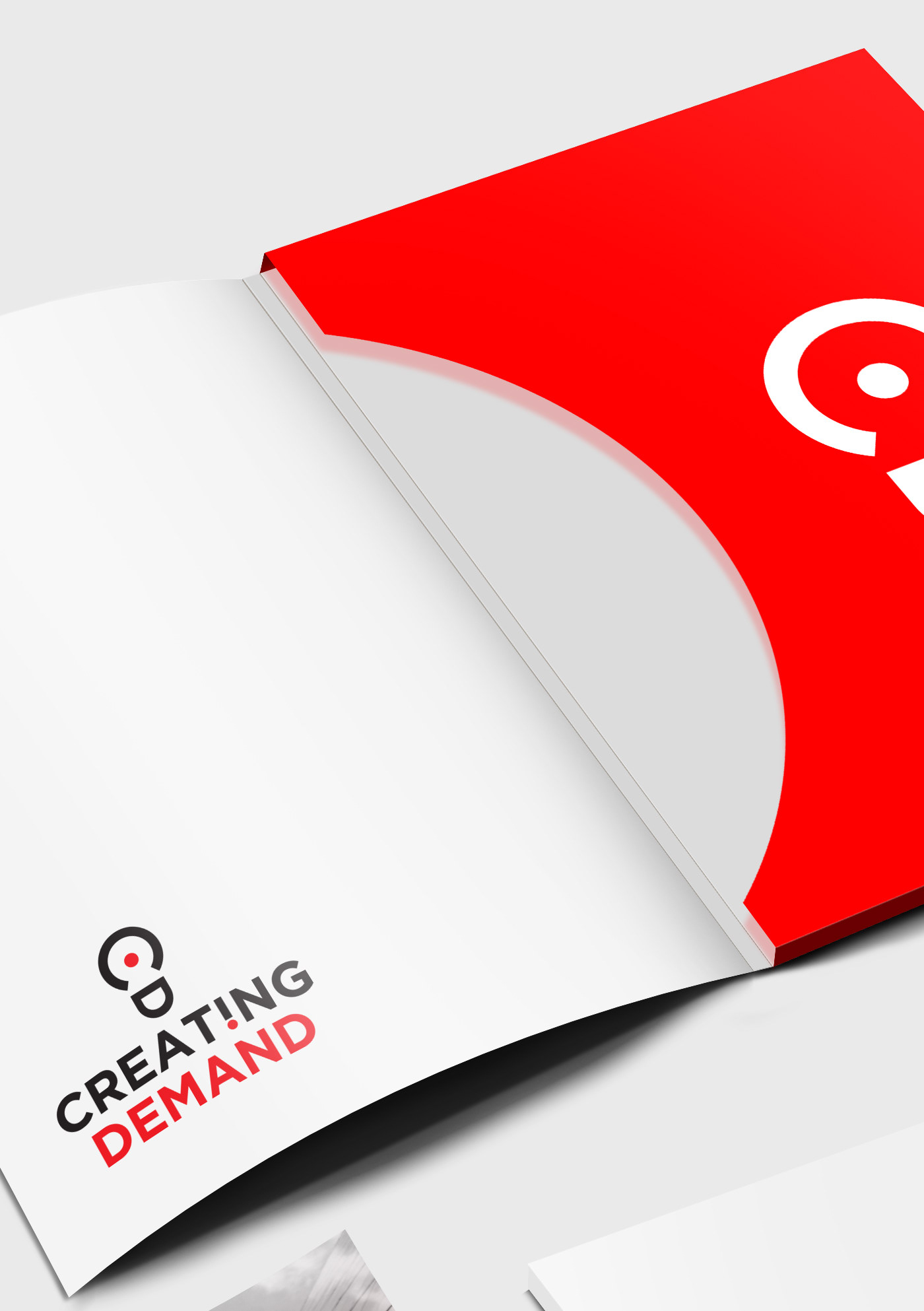
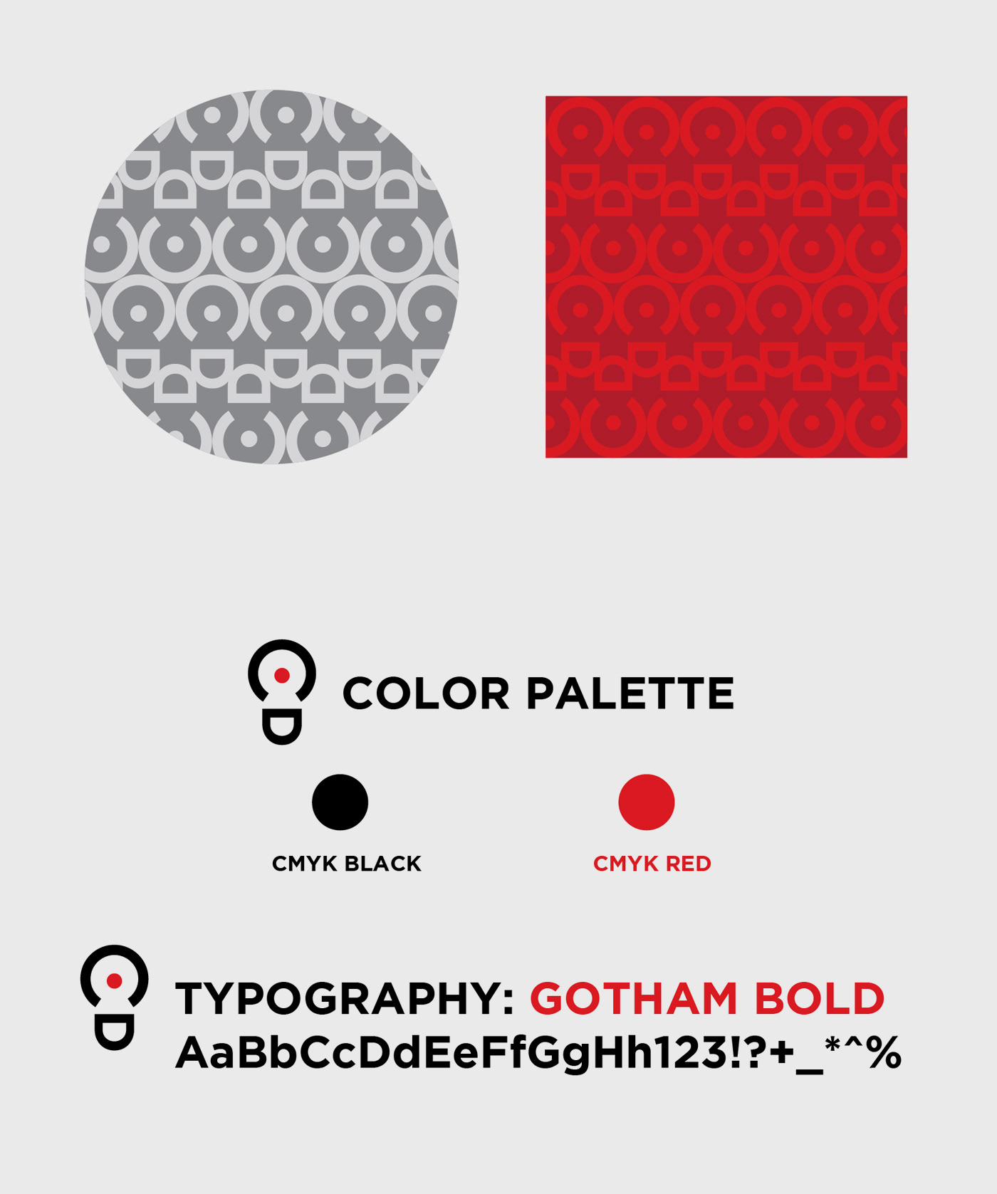
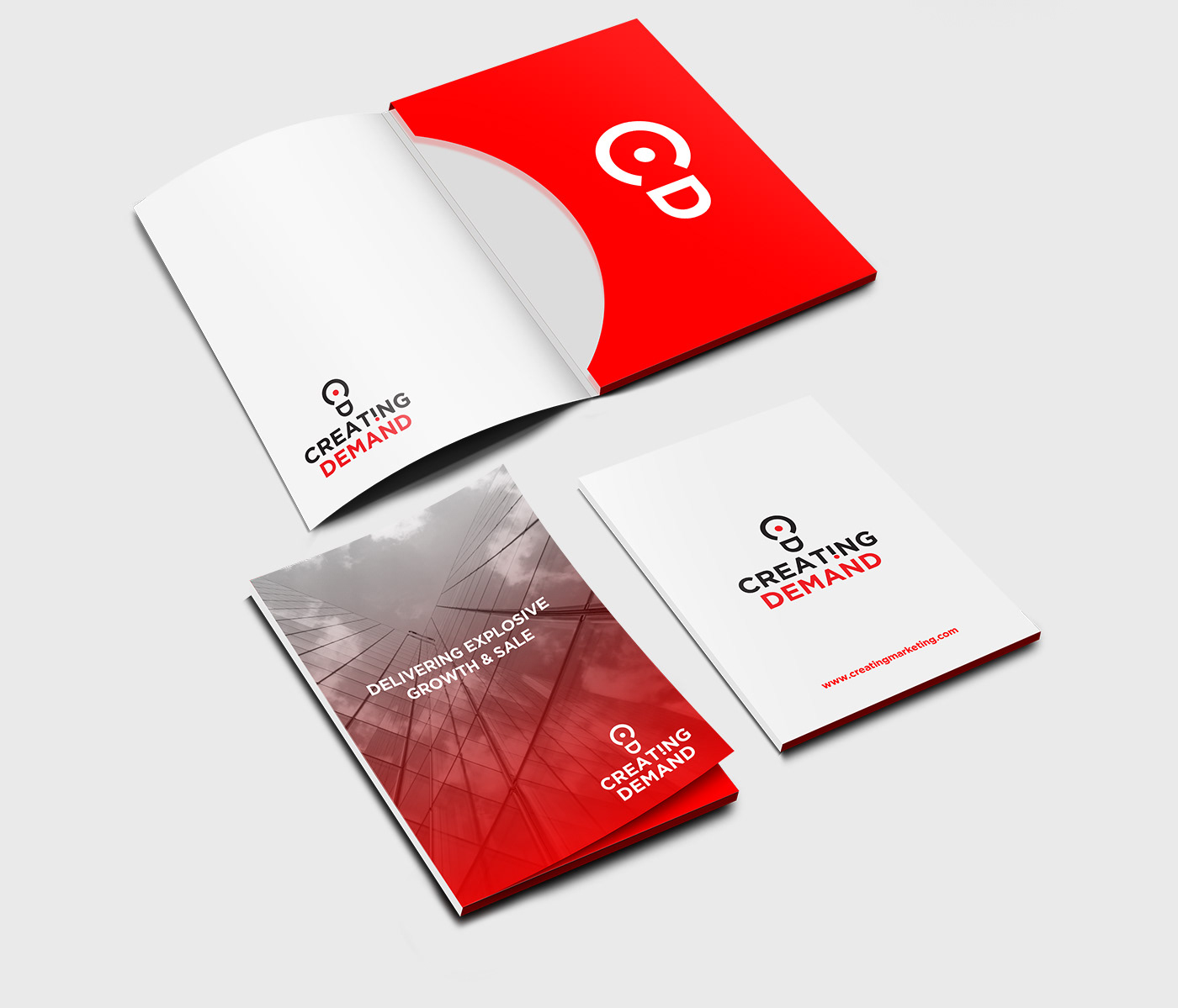
The sign itself is a “smiling bulb”. It is developed from the initials C and D. By that, the connection between the mark and the logotype is secured. Also, the logo works well in monochrome version and is highly applicable in various media.
As for the colour scheme, the combination of red, black, and white is eye-catching and calling to action.