Client
Octagon Business Group | Toronto, Canada
Info
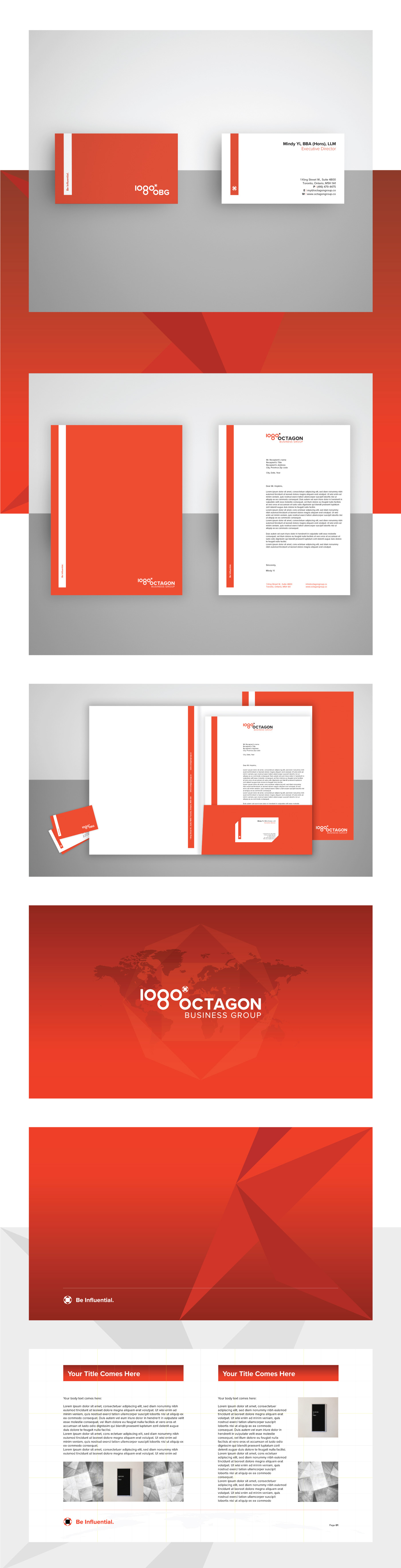
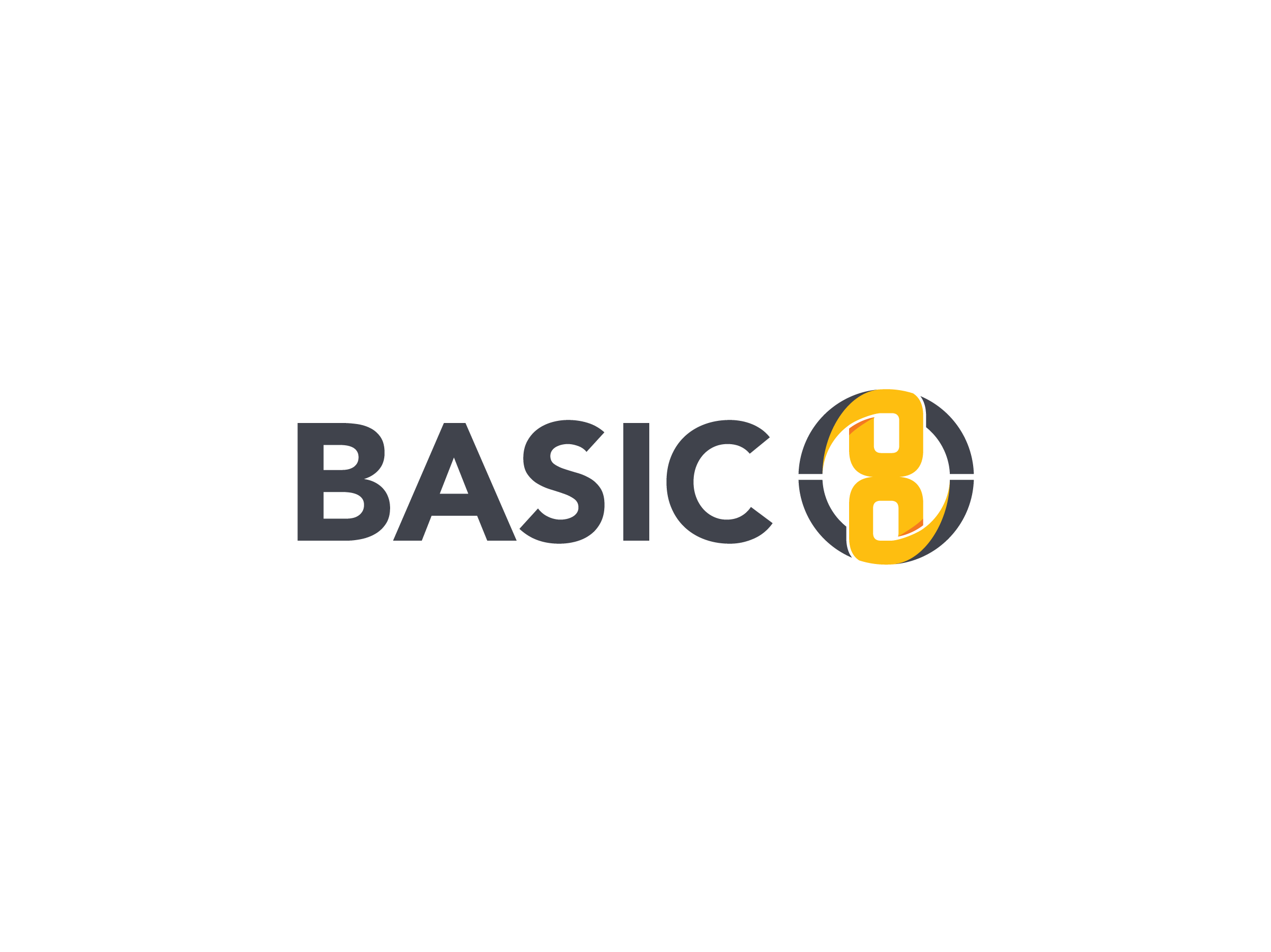
Octagon business group is a multi disciplinary consultancy company that has been developed over the past several years.
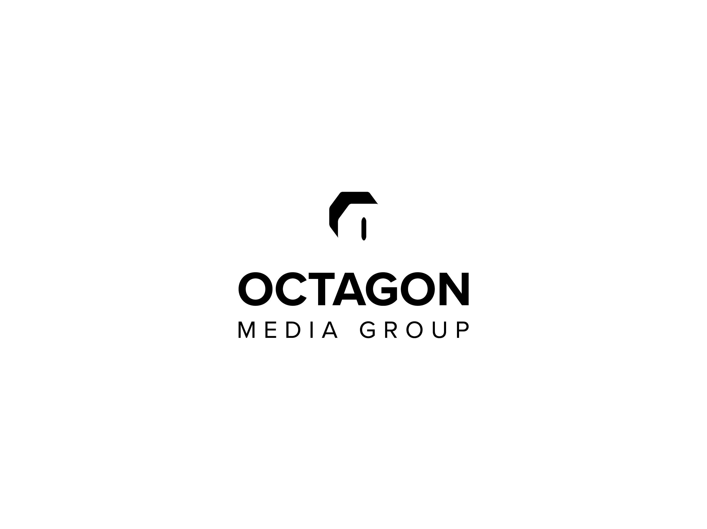
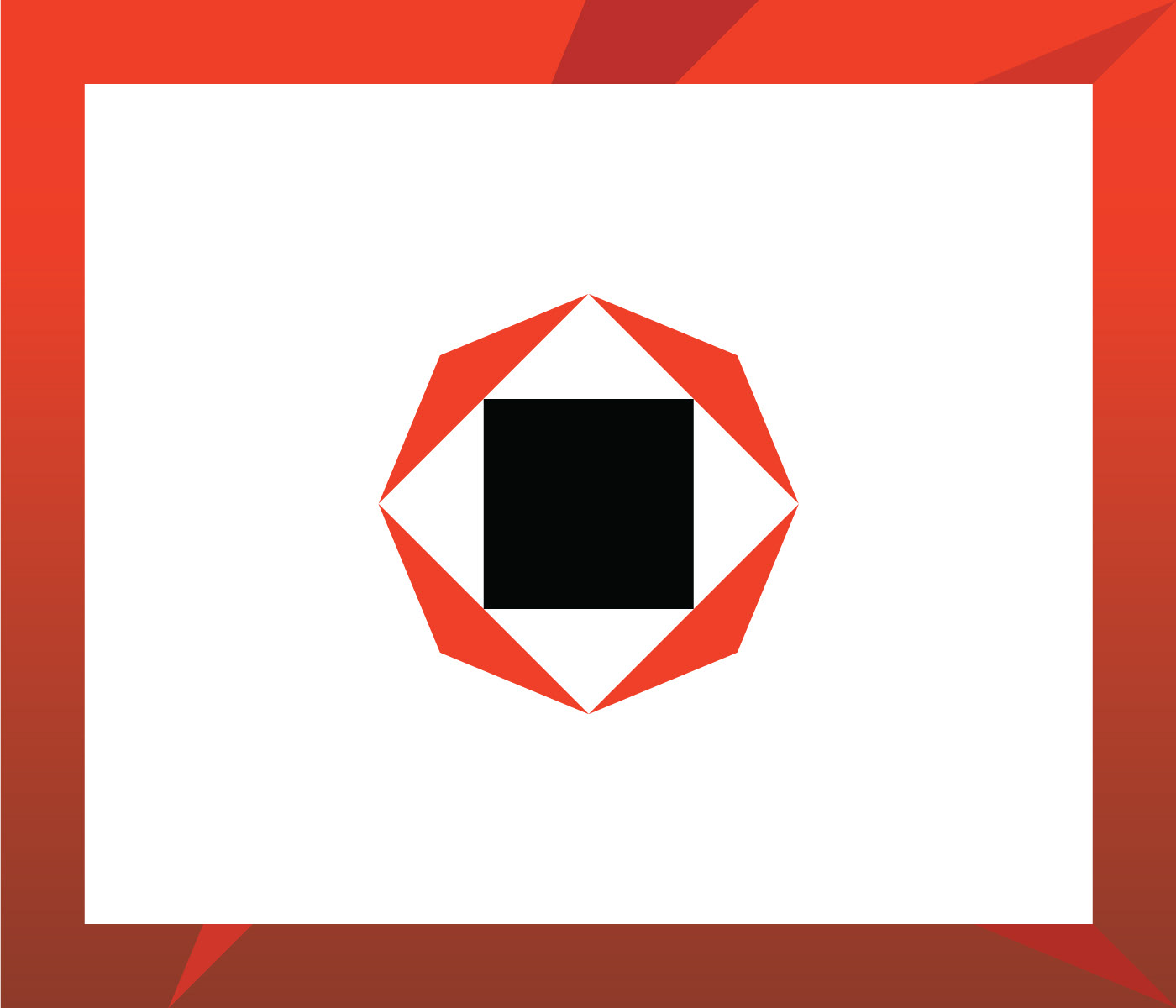
The solution represents a play between numbers and letters. Namely, as the angle sum of an octagon shape is 1080 degrees, this idea was put in front to visually communicate an octagon, in an indirect and more intriguing way. Then, the degree sign has been replaced by a stylised octagon symbol, that works as an avatar, icon or favicon. The choice of a bold, sans-serif typeface as well as colour scheme contribute to the overall modern and fresh aesthetics.
The Octagon business group logo comes in two variants – with the full name and as an acronym.
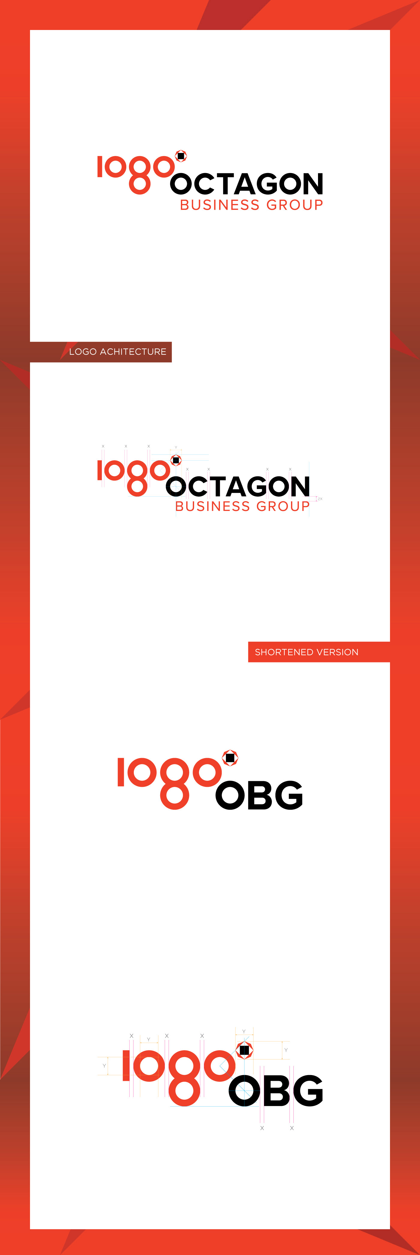
The stylised octagon highlights the company’s four consulting products. The arrows (both red and white) suggest company’s equal strength, excellence and dedication, whichever part/side of the world is heading to.
Clean and simple style of the logo has been extrapolated to the corporate material. The layout for the letterhead, business card, presentation folder as well as PowerPoint template is the result of an attentive approach.