Client
Energy Advance | Perth, Australia
Info
Energy Advance is one of the largest energy consultancy firms in Australia.
I was asked to develop a logo solution that is relevant and reflects the company objectives.
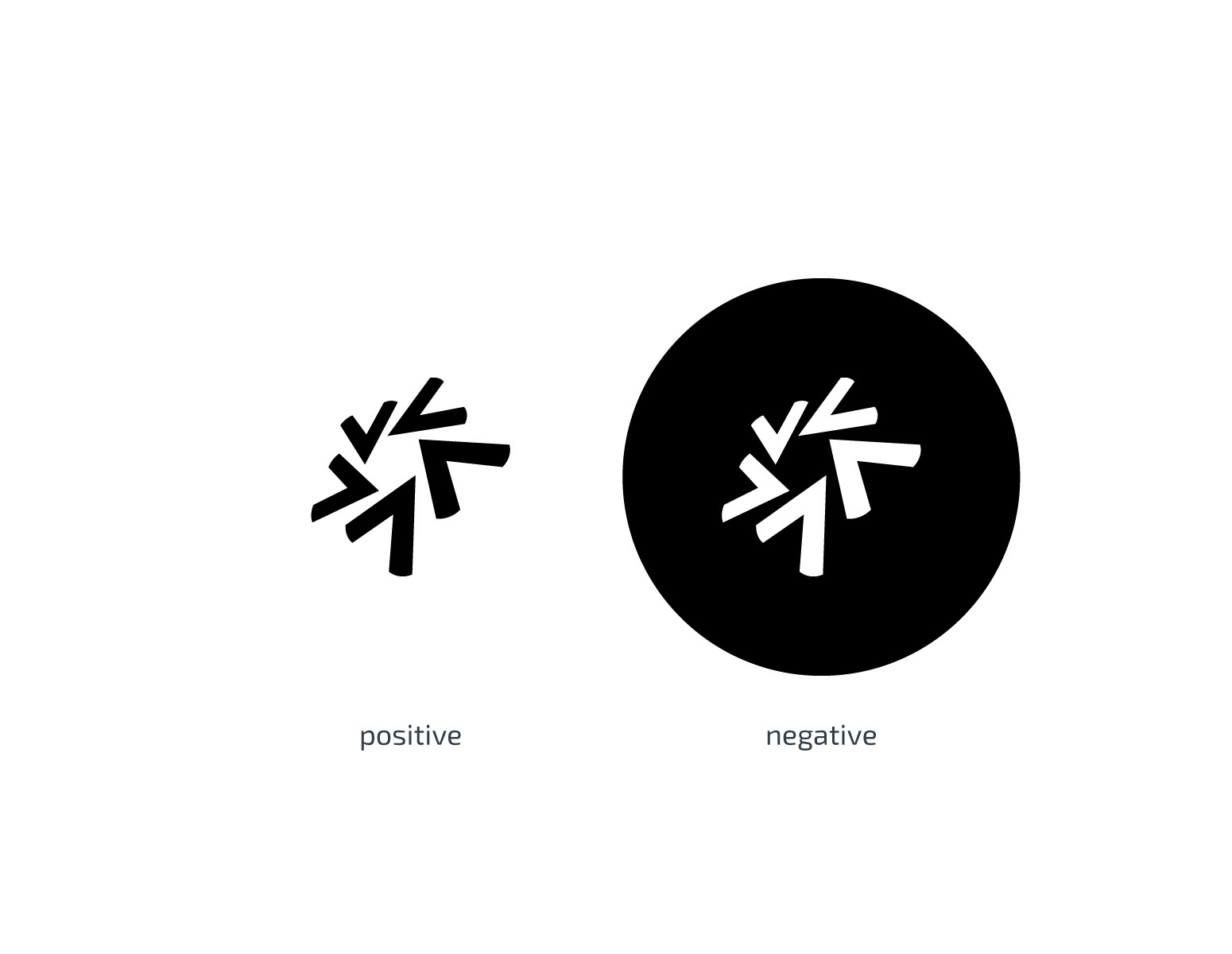
The new logo hints at the company’s vision to expand into several new services. Thus, the mark is made up of five arrows to symbolize 5 services–energy consulting, engineering, land surveying, project certification, and drafting.

The arrows form a circular shape, suggesting a completion and fulfilment. Furthermore, the mark could be seen as a stylised star, echoing excellency, as a stylised cogwheel, hinting at precision and engineering. Finally, the mark states collaboration, renewability, versatility and flexibility.

The new logo fits perfectly in square shape. This is important for presentation on various digital platforms. For example, this logo can be scaled down to a size of a favicon without losing its visual impact.

As shown below, the logo works perfectly both as positive and negative.
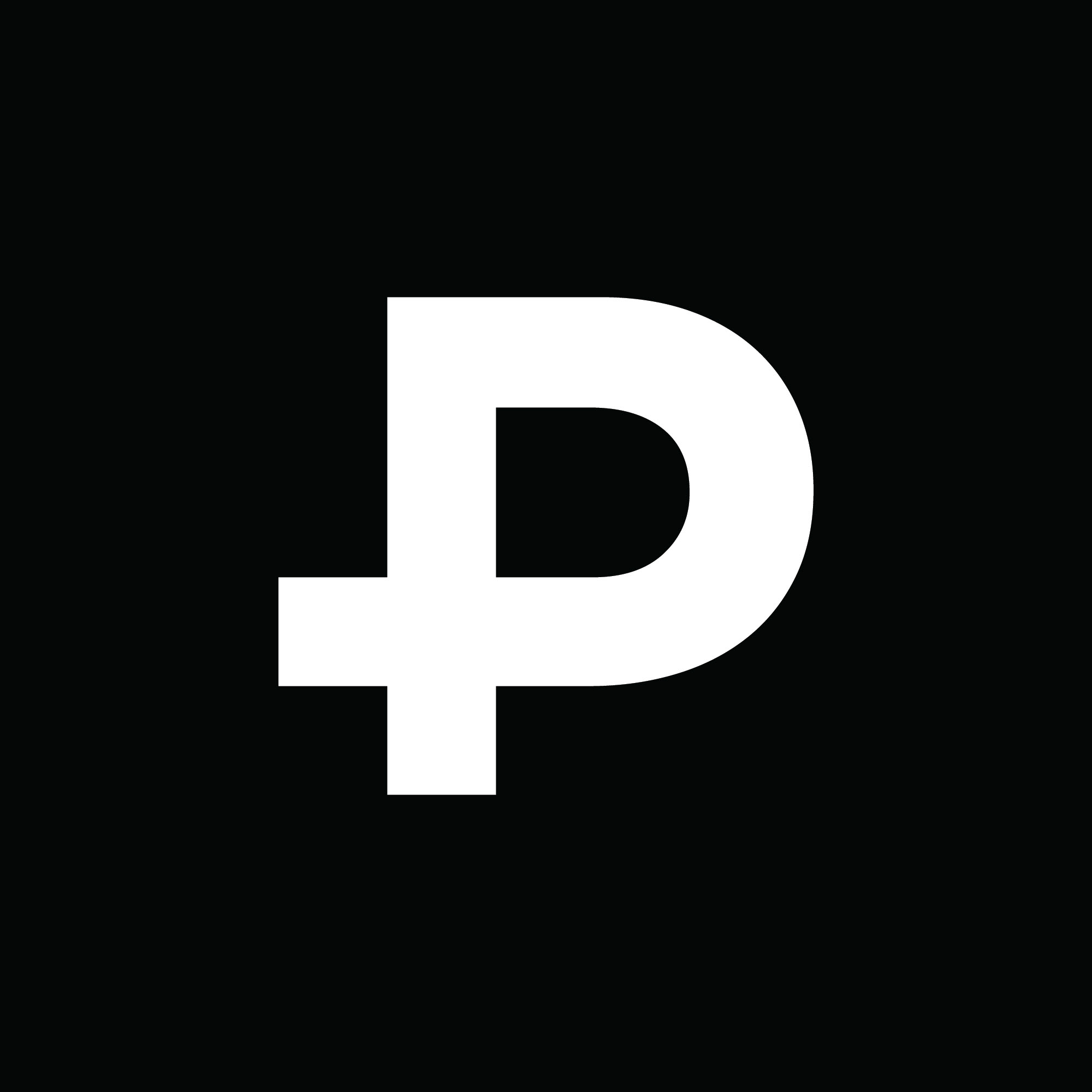
The signature is the key element of the Energy Advance identity system. It has been carefully designed to create a balanced configuration. The logotype is set with specific letter spacing. The shift of the word “advance” to the right not only alludes to the energy (moving forward) but also depicts the meaning of the word.

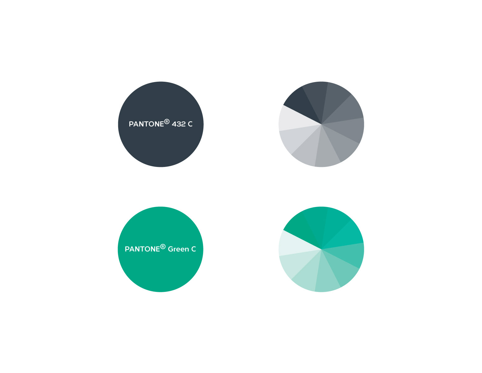
Corporate colours has been carefully selected to relevantly present the objectives of the company.
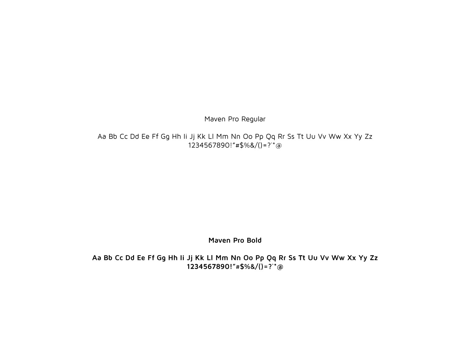
The primary typeface for Energy Advance is Maven Pro. This sans-serif typeface with its unique curvature and flowing rhythm has been chosen for its
legibility, distinctive forms and suitability for any media.
Website