Client
Appreciation Society | Auckland, New Zealand
Info
Appreciation Society is a newly established company, based in New Zealand.
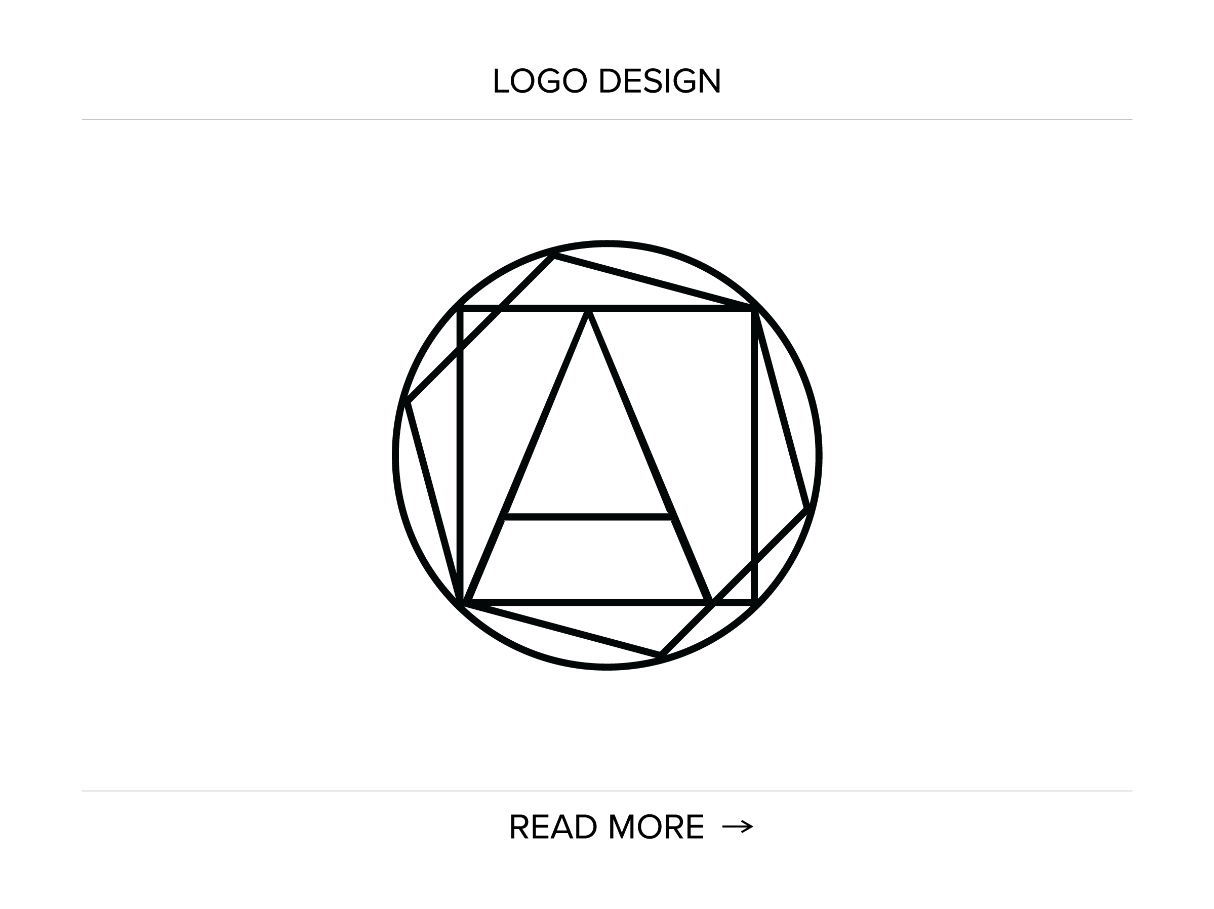
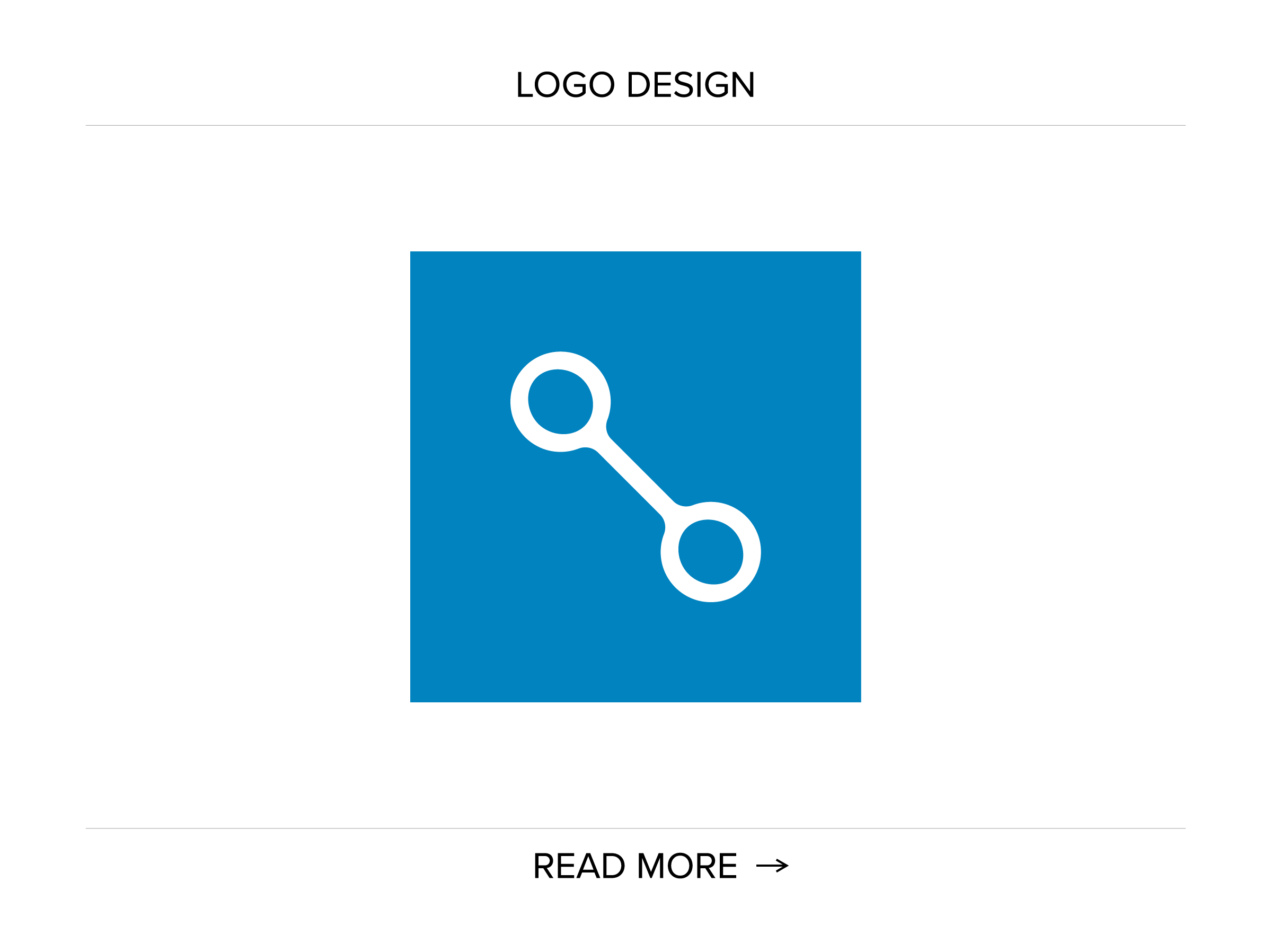
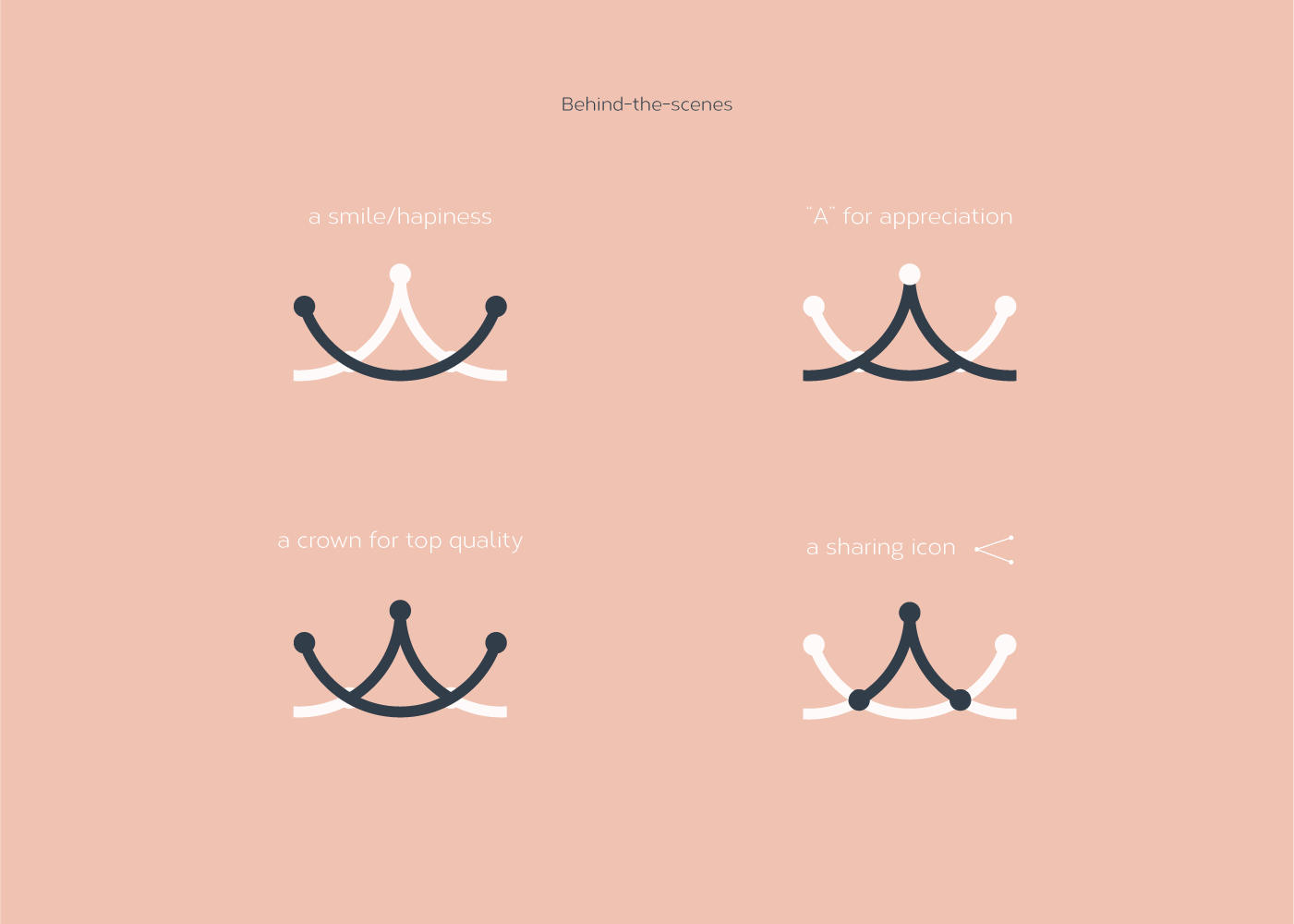
The logo solution represents both a stylised crown to speak an elegant, high-end product and top quality service and the stylised character “A” that stands for “appreciation.” The nodes symbolise the places of meeting, interaction and sharing.

The logo “conceals” several symbols that are relevant to the company’s objective. At the same time they served as a source of inspiration:
The Appreciation Society logo is the result of a meticulous approach. Nevertheless, it’s simple, bold, applicable and easy to reproduce even by hand.

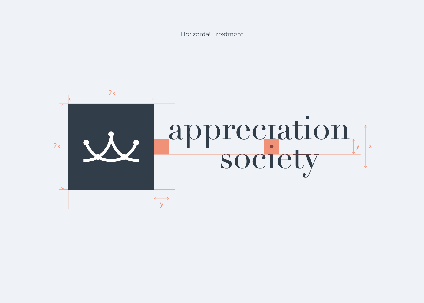
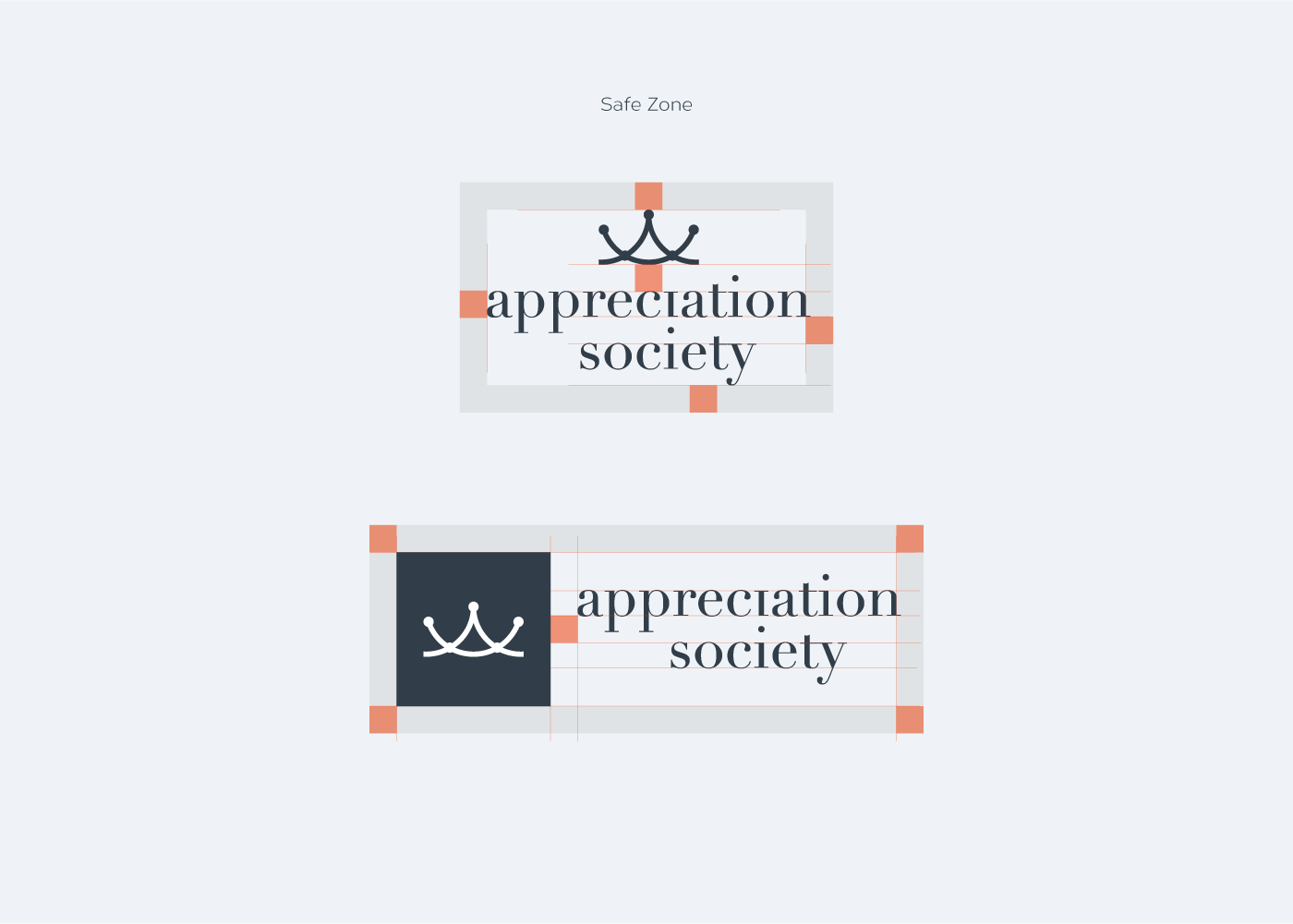
The Appreciation Society signature has both vertical and horizontal version.
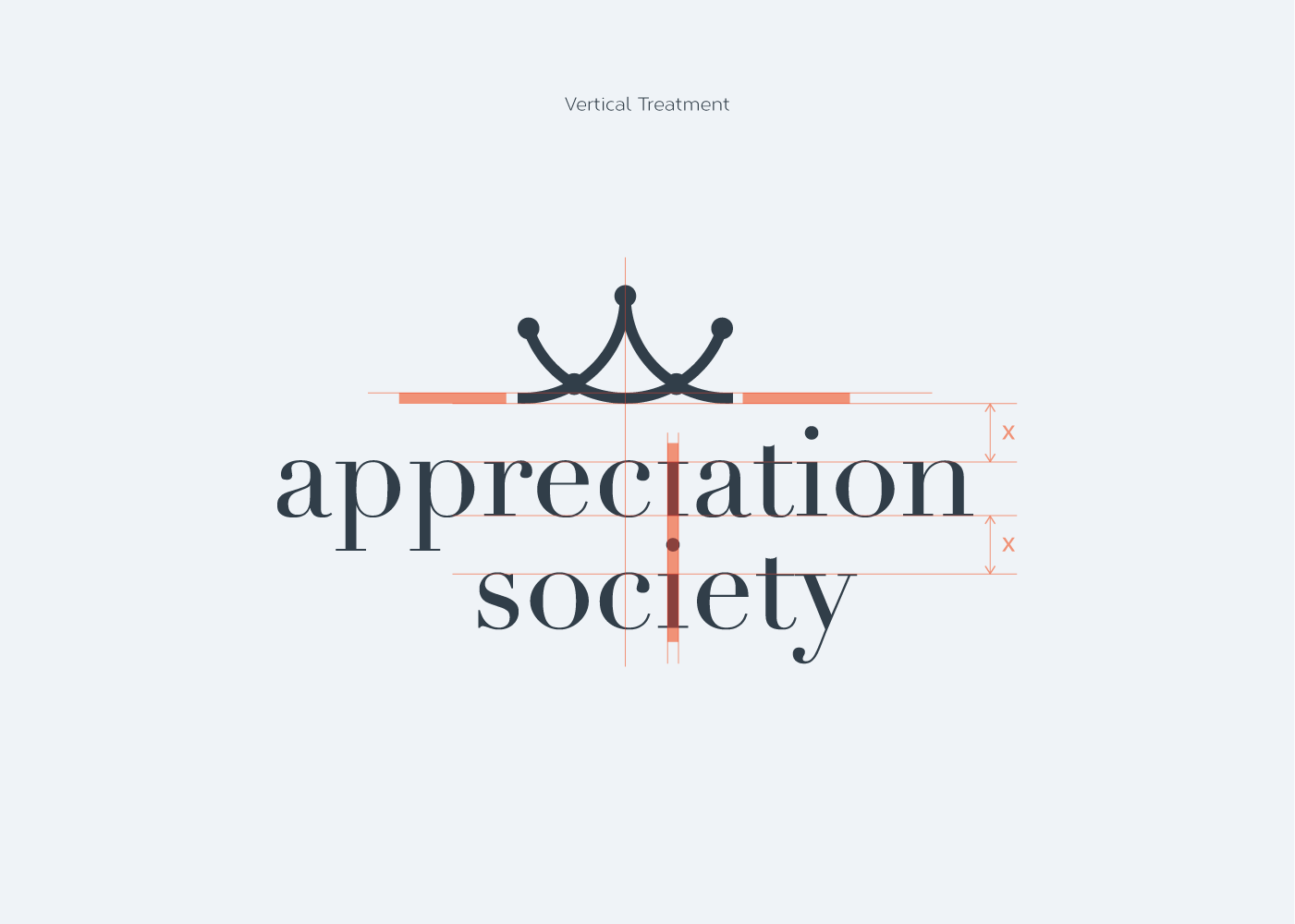
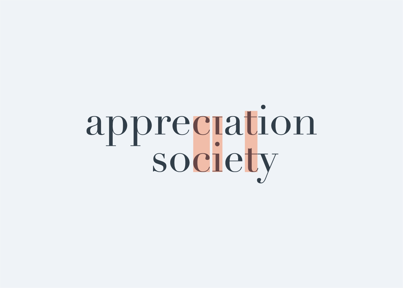
Please notice below how the character “i” is inverted in the word “appreciation.” This simple intervention makes the logotype unique. The word “society” is then positioned so that the “i” character shares the same dot with the “i” from “appreciation”. The sharing dot could be seen as a gift; as a place of interaction (giving / receiving); as a meeting point; as a hub. Moreover, afore-mentioned inverted “i” brings a moment of excitement since it could be perceived as an exclamation mark.
Worth mentioning is the characters’ rhythm and repetition in the words that constitute the logotype. That fact additionally contributed to a compact overall look.
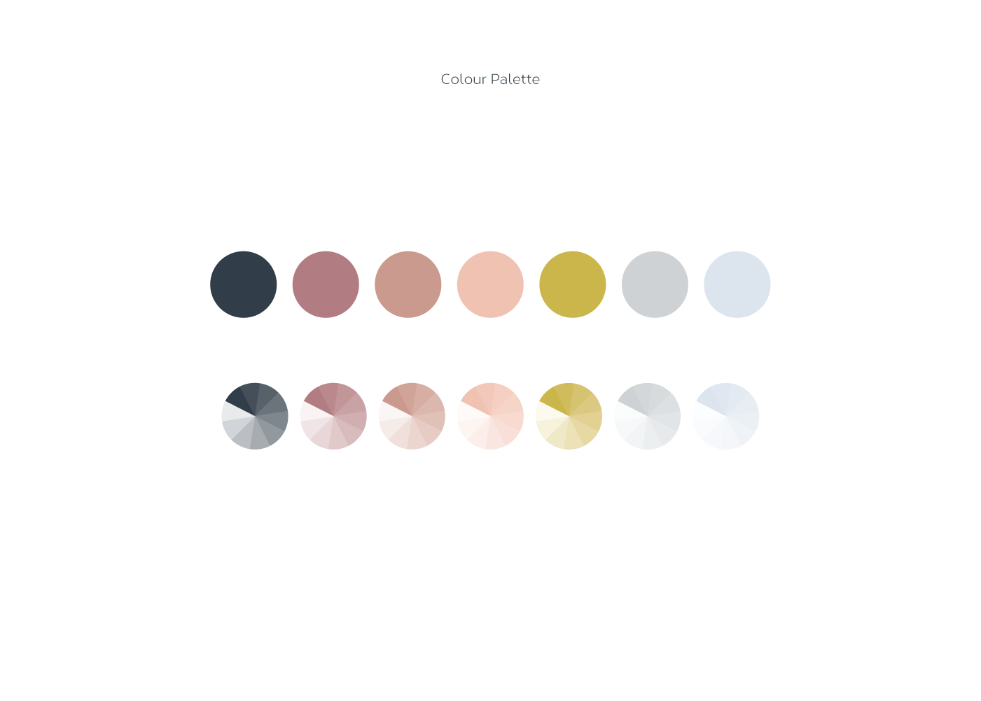
The Appreciation Society signature speaks gender neutrality. That quality has been translated into colour palette.
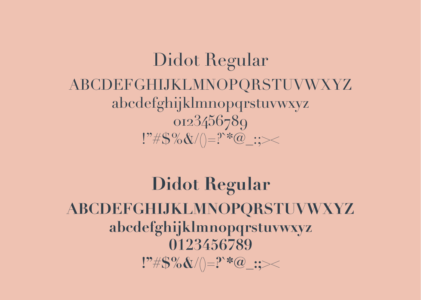
Didot typeface has been chosen for the logotype. This typeface has been fashionable for over 200 years. It is a Neoclassical serif typeface. It possesses timeless ability and it’s modern, stylish, exclusive, classical, and elegant. It simply speaks history and durability.
Characteristics:
1) High and abrupt contrast between thick and thin strokes;
2) Abrupt (unbracketed) hairline (thin) serifs
3) Vertical axis
4) Horizontal stress
5) Small aperture